How to combine colors: blue and green
For this new article “tips and advice” around colored ranges, I wanted to tell you more about the combination of blue and green .
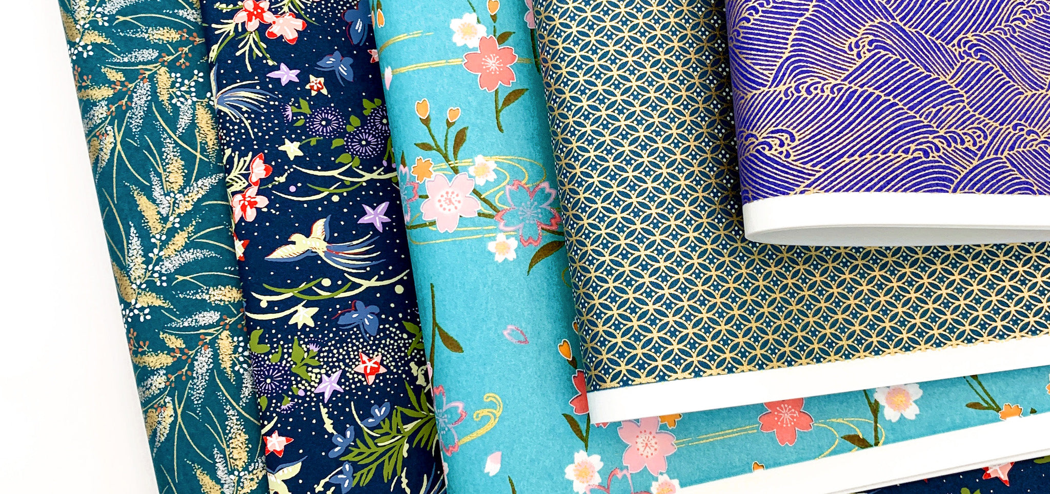
It's a palette, soft and fresh, which reminds me of nature and more particularly, seasides, lakes and ponds but also vegetation, aquatic plants... I hope it will inspire you as much as me !

PHOTO CREDIT – ADELINE KLAM
If you don't know this series of articles and want to read others, here are the three previous blog posts published around colorful associations:
- How to combine colors: yellow and green
- How to combine colors: blue and orange
- How to combine colors: multicolor harmony
It's a series that I really want to develop. So don’t hesitate to share your colorful questions with me in the comments!

PHOTO CREDIT – ADELINE KLAM
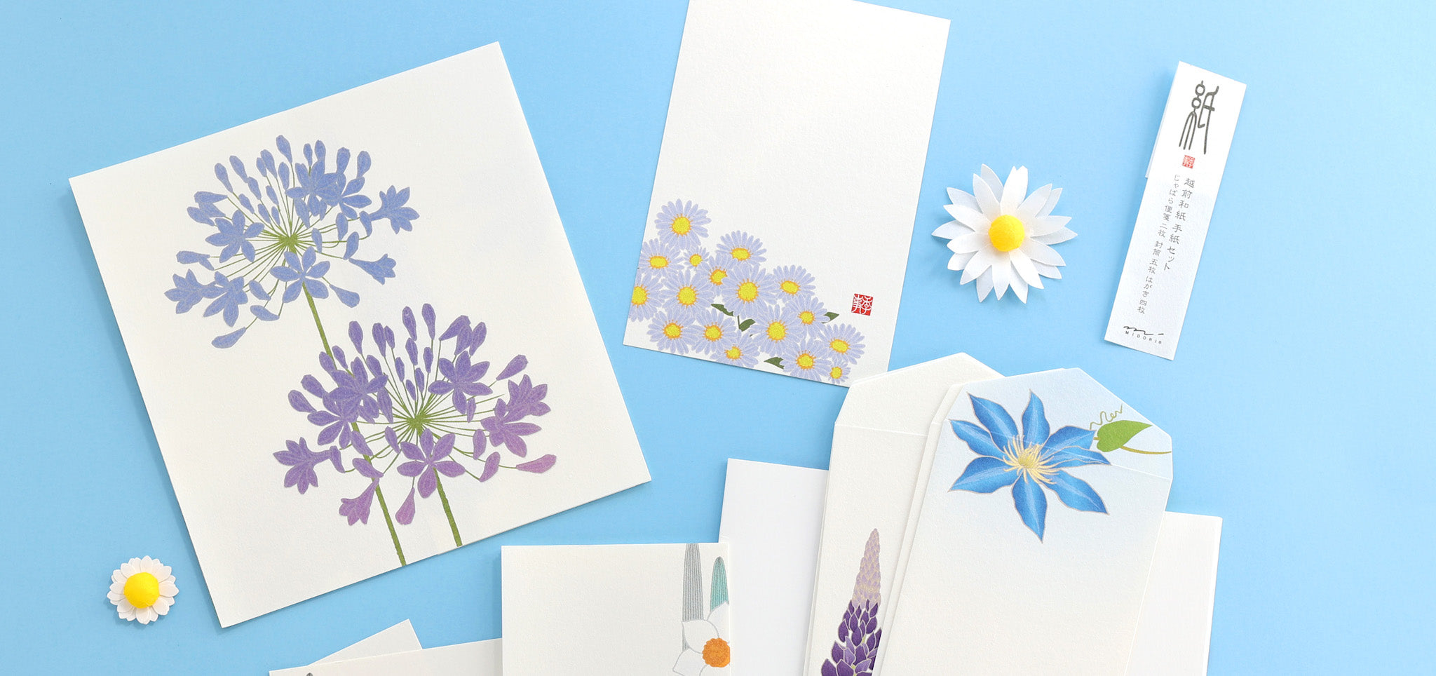
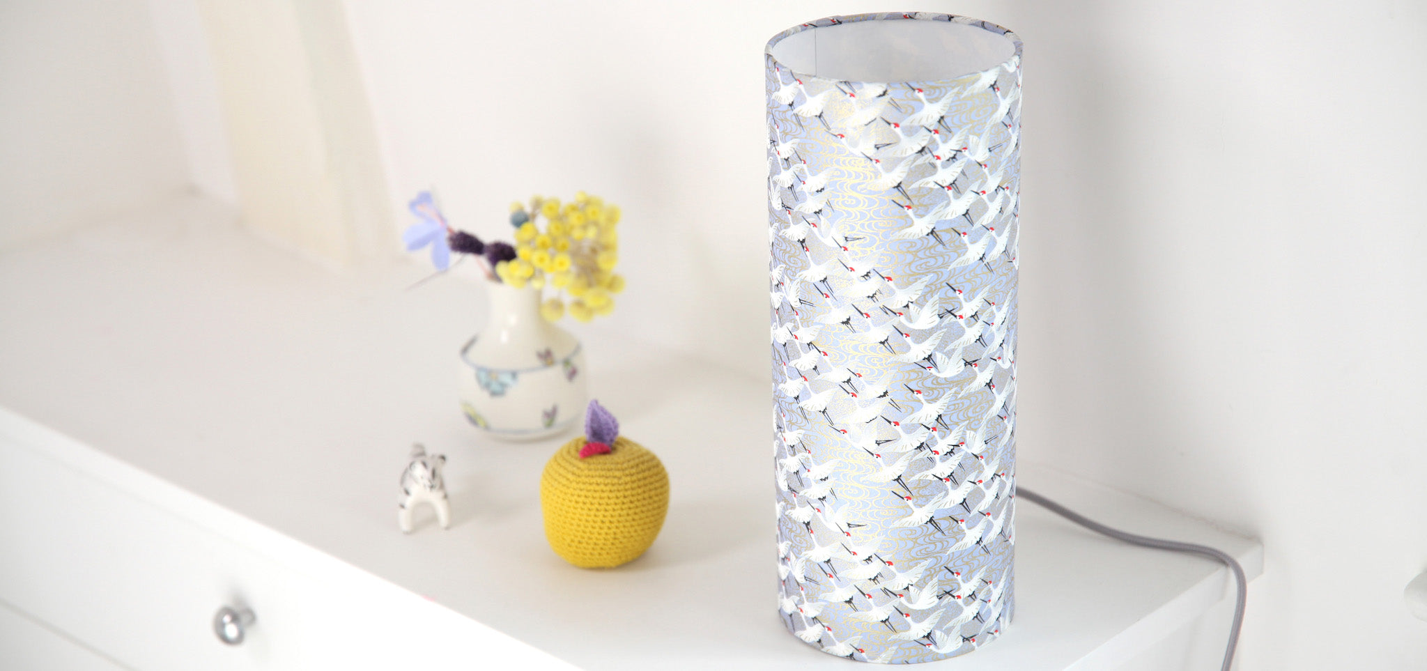
For this combination, I went with a gradient of cold colors: blue and green. They are often considered calm, soothing and serene but are not bland and dull! If you want to compose a colorful harmony easily, you can start with a monochrome of one and the same color or as in the previous case, a gradient of two colors which are located next to each other on the color wheel .

PHOTO CREDIT – ADELINE KLAM
HOW TO USE IT ?
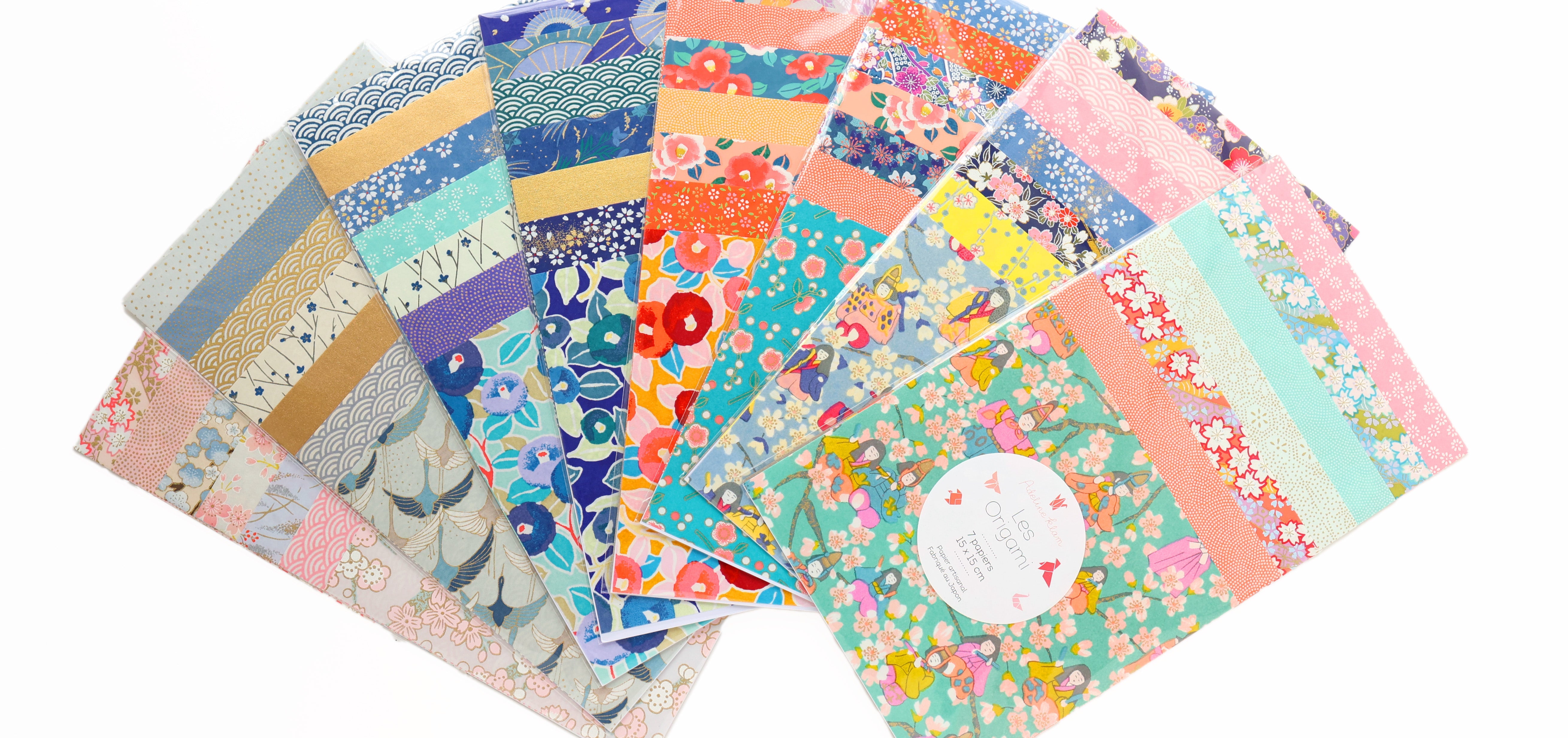
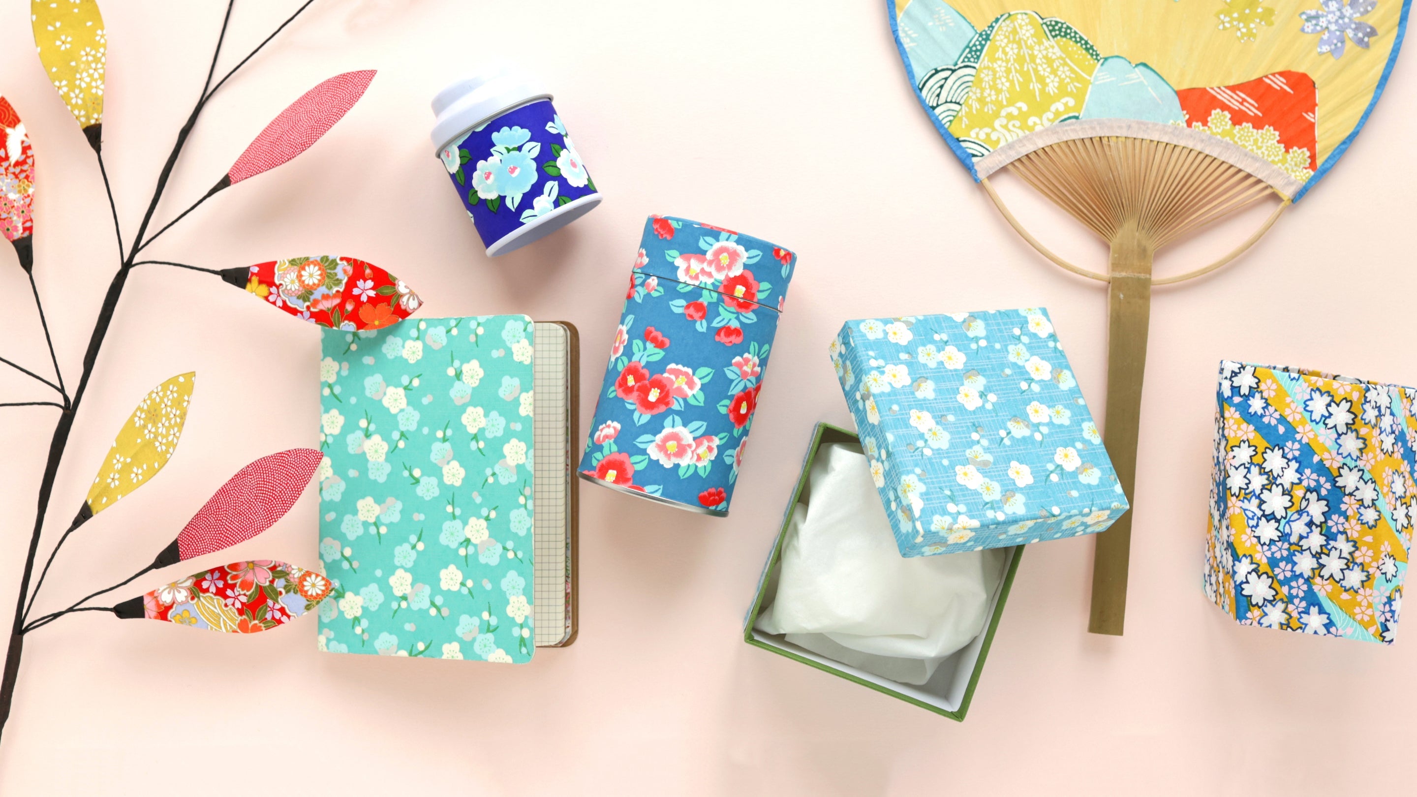
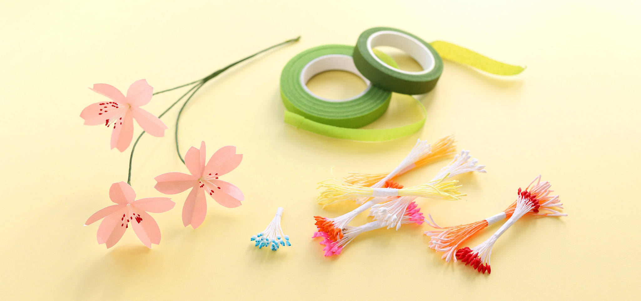
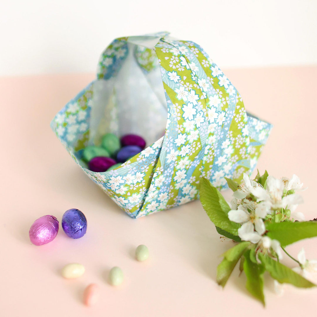
This soft palette of “Blue and Green” colors is ideal for a bedroom to create an atmosphere conducive to relaxation but also for a bathroom, thanks to the aquatic side evoked by blue. It's a colorful combination that we have used in several creative kits, notably the origami tassels and stars which subtly decorate a room, without being too present.

PHOTO CREDIT – ADELINE KLAM
HOW TO COMBINE IT?
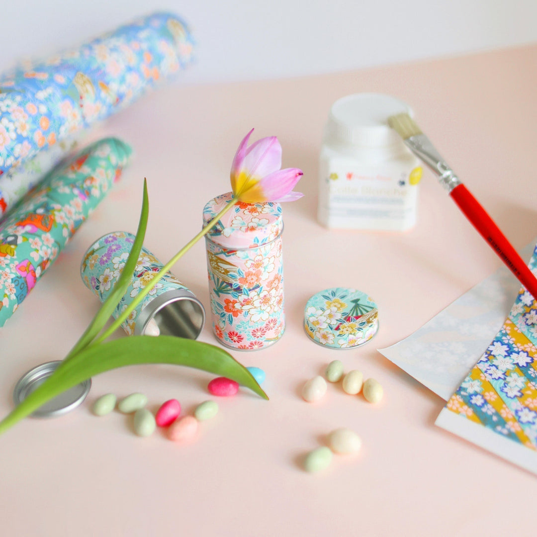
Blue and green are colors that can be declined in an infinite number of tints and shades, more or less warm or cold (but also light or dark, saturated or not) and which can therefore evoke very different worlds.
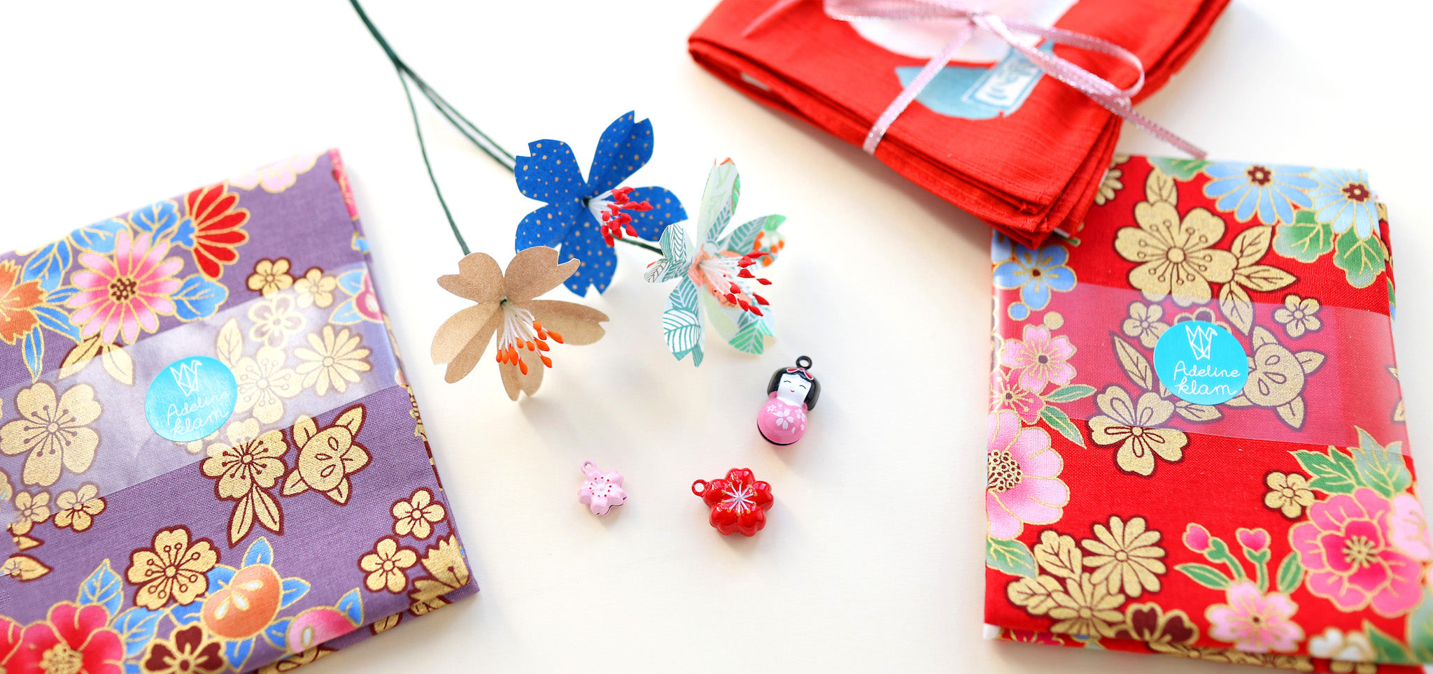
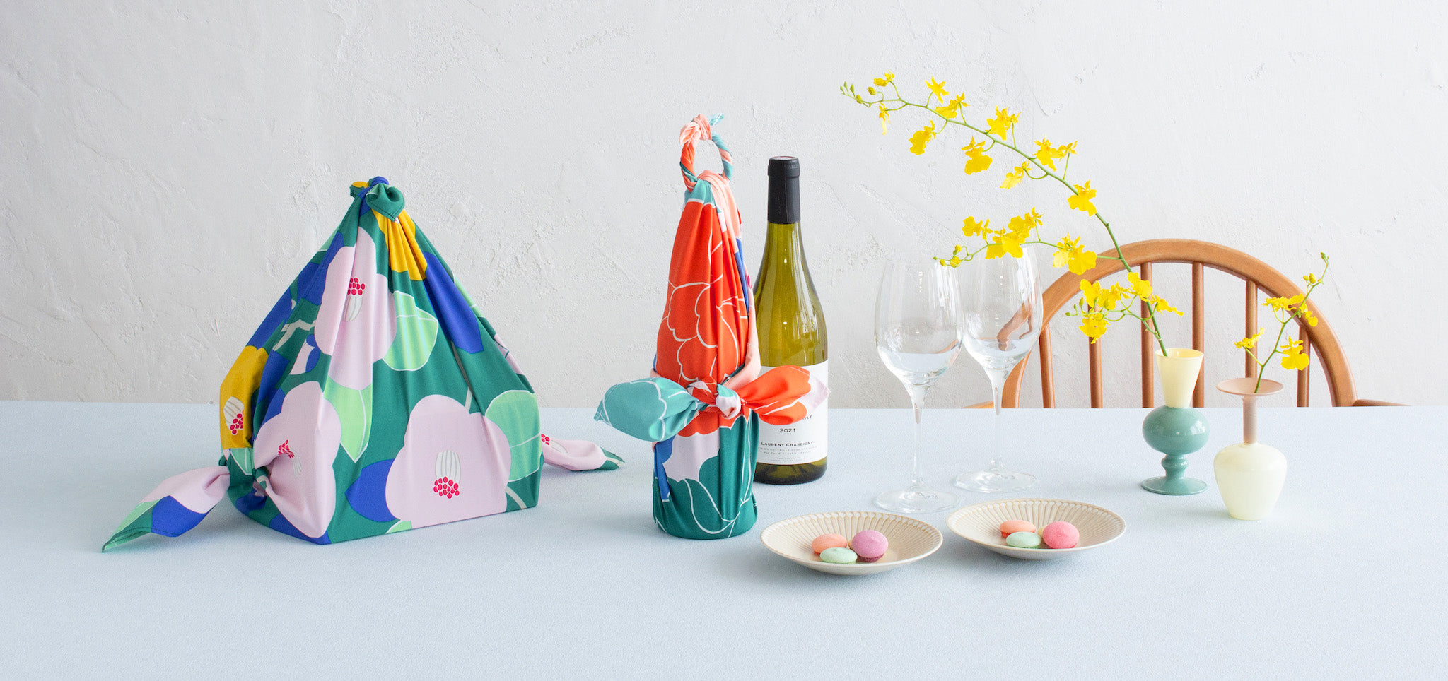
In this case, I opted for cold blues and greens. I also chose to combine intermediate colors, which mix both blue and green, like turquoise or sea green for example. To enhance everything, I opted for midnight blue, purple and acid green. I sometimes like to add a warm color like yellow to this combination of blue and green, which makes it a more joyful range.
These are the colors that I selected for our new kit “Bouquet of Crépon Flowers - Capri” (photo above), which reminds me of a vacation by the sea. It is a bouquet of soft colors, which I I hope it will accompany you throughout the arrival of sunny days.
-------------------
I hope you enjoyed this article and made you want to use this colorful range in your future creative projects, for example.
I'll see you again very soon for new blog posts!
Adeline
What are your favorite colorful combinations?
Leave a comment