Inspirations - My Colorful Universes #2
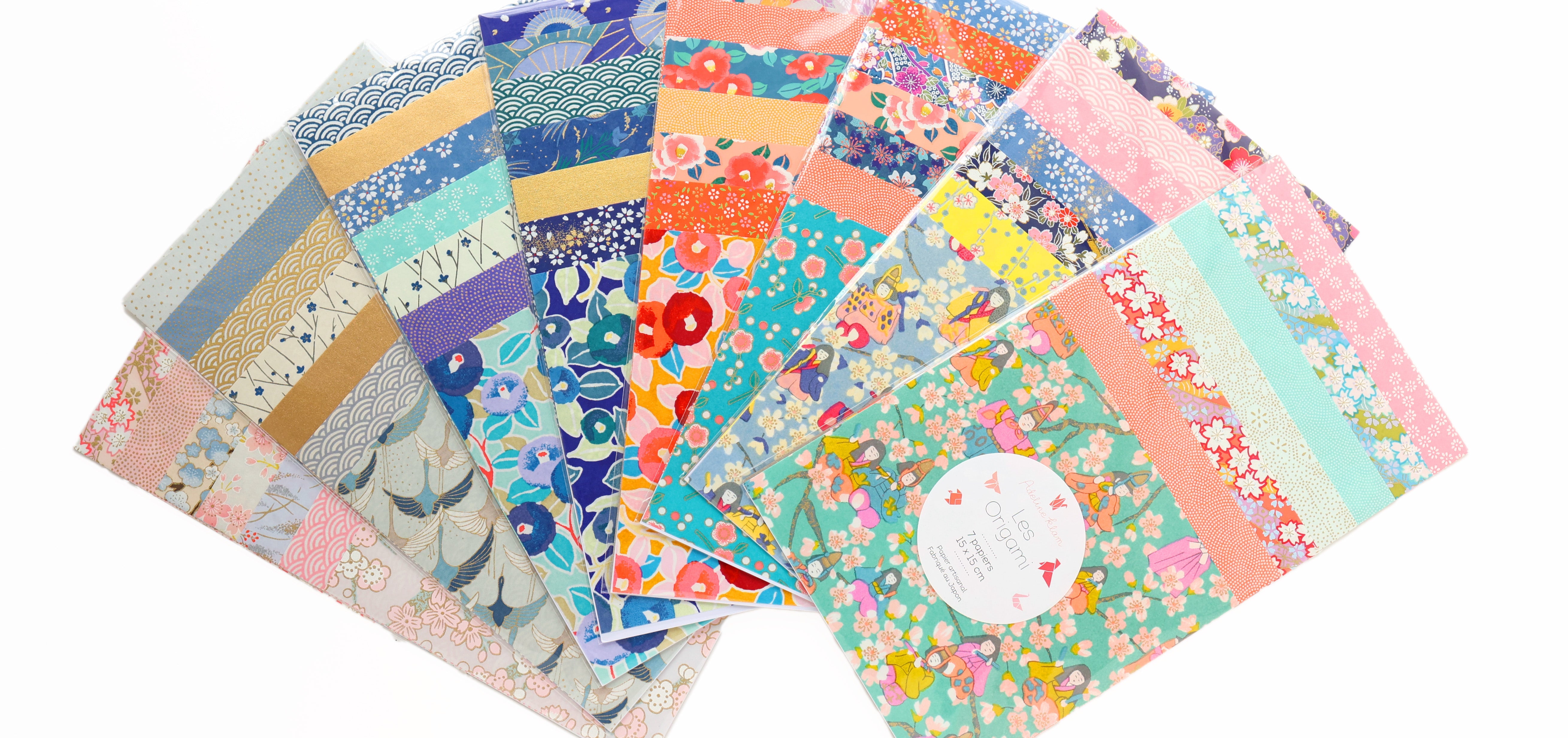
I meet you today in this new article to present new colorful harmonies around various and varied objects that I have selected in store! You really liked the first article on this subject “Inspirations – My Colored Universes #1” and it is with particular pleasure that I offer you a new article on this subject, with 4 new colorful universes composed around our book covers. 7 squares of Japanese paper.
-------------------
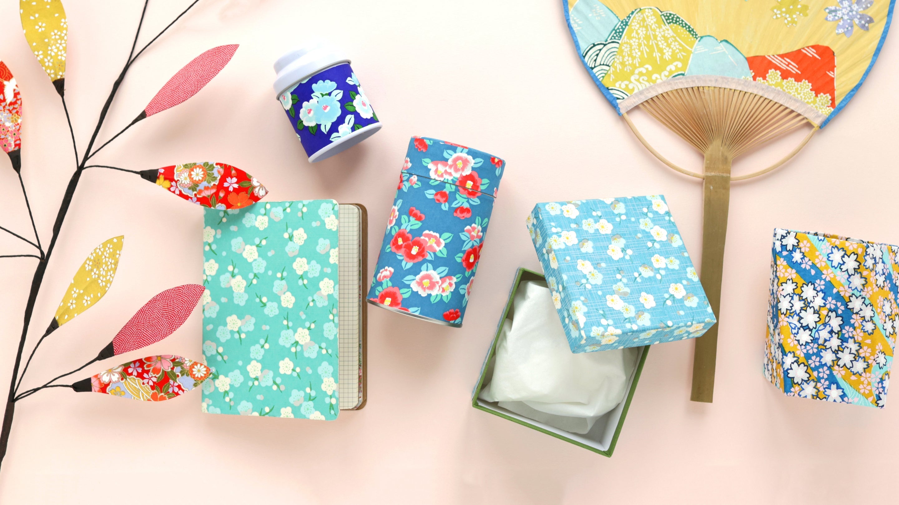
For each colored harmony, I have listed the products presented in photos. If one of these products is not listed below, it is not available on the e-shop but may be available in store.
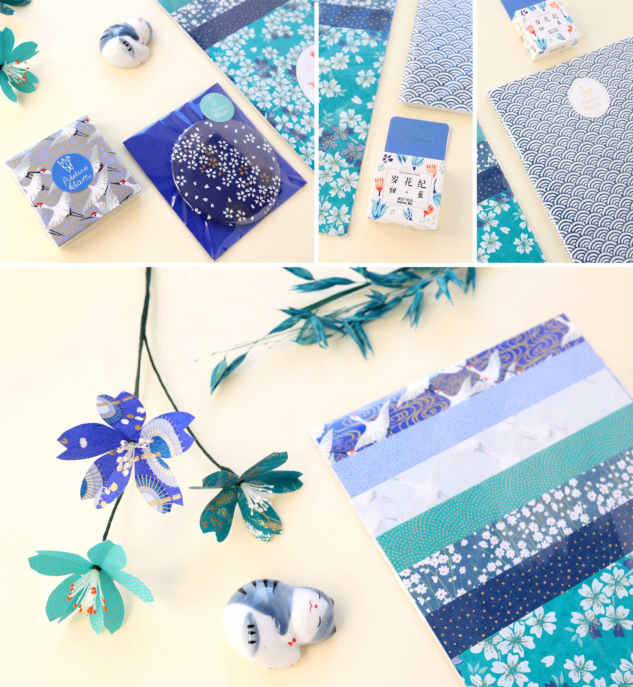
THE NIGHT BLUE AND DUCK BLUE RANGE

For this colorful harmony, I started with an adorable little ceramic cat with a blue-gray coat who seems to be sleeping peacefully. I naturally associated it with our “Aokakesu” origami pouch in different tones of blue and dark green. It’s a cold and elegant range, with deep shades that you really like (and me too)! I then added a few objects picked up, here and there, from the store to complete the whole, including a few flowers and foliage which soften the whole. If this colorful universe inspires you, I invite you to discover our article “How to combine colors: Blue and Green” .
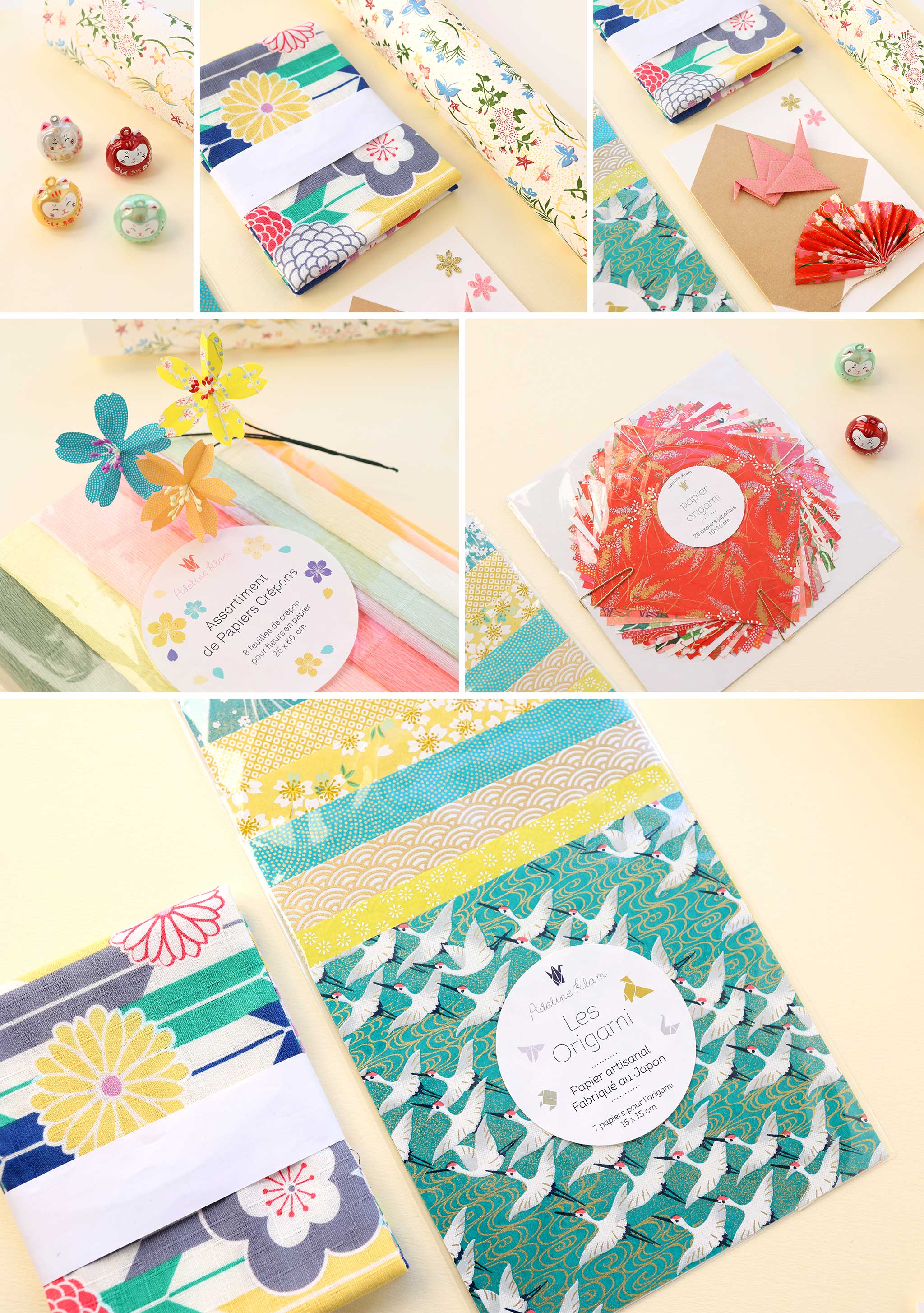
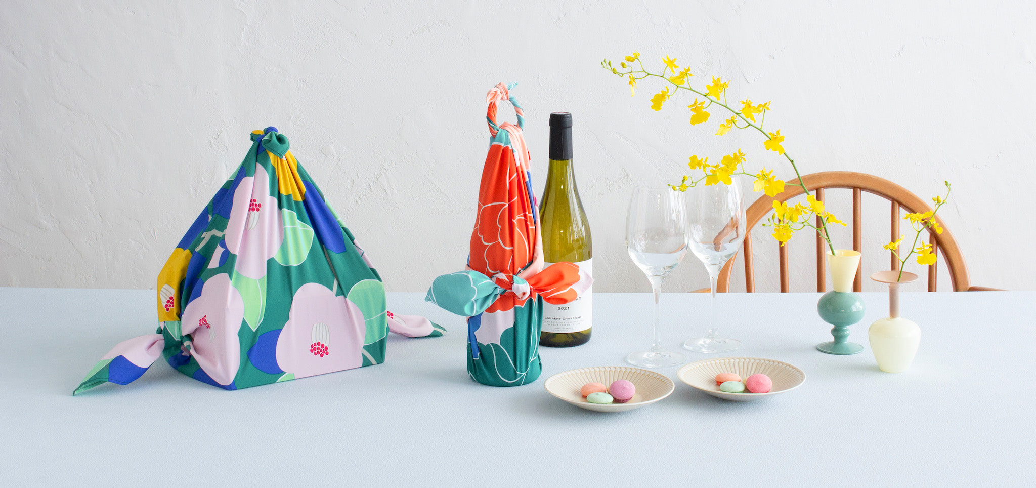
THE RED ORANGE AND WATER GREEN RANGE

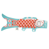
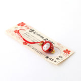
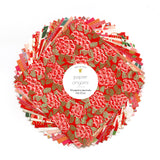
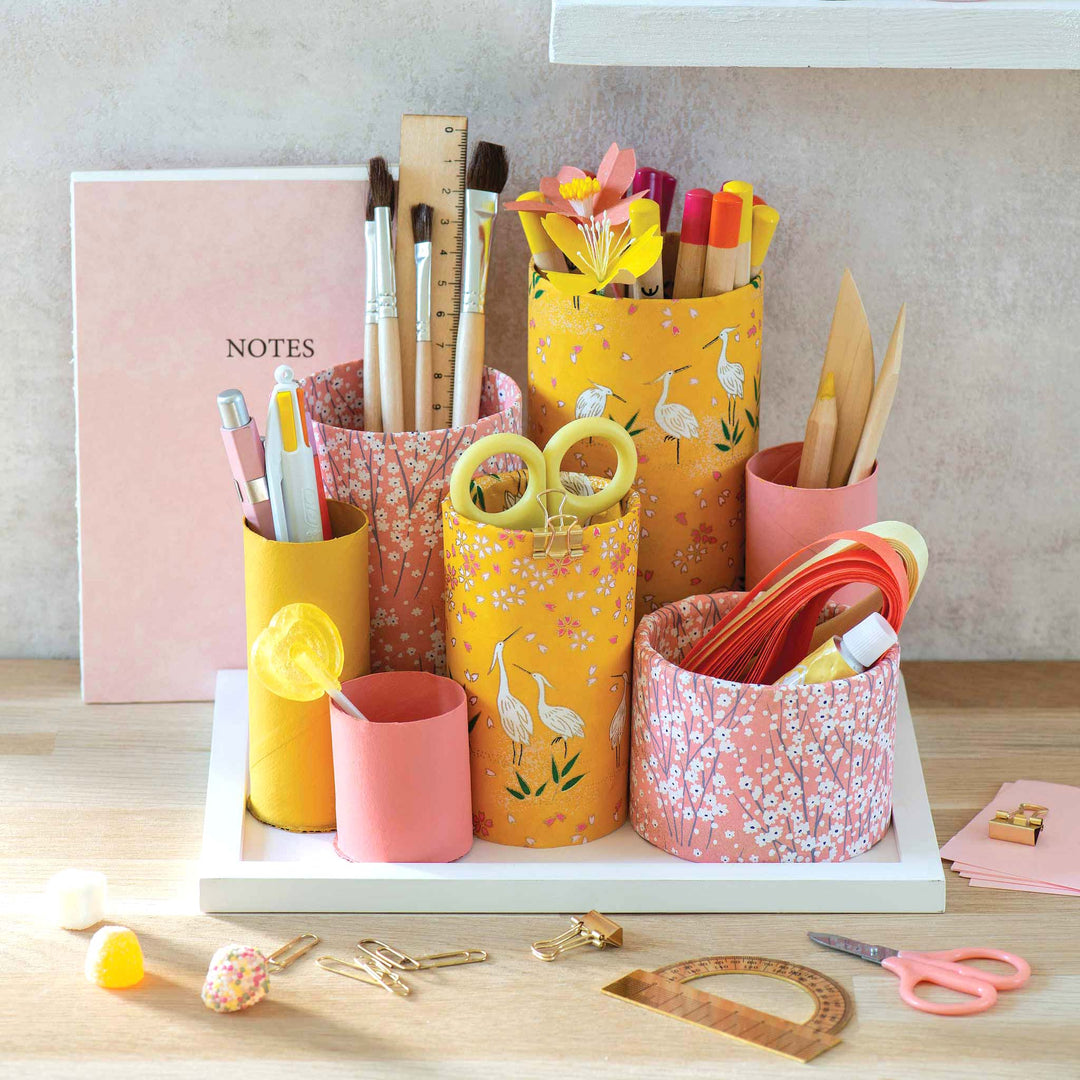
The combination of shades ranging from orange to red and blue to green works wonderfully. Since orange and blue are complementary colors with a warm/cold contrast, it is easy to combine them together. I also published an article on this subject “How to combine colors? The Blue and the Orange” if you’re interested. Beyond this combination of colors which works well, I really like the mix of patterns of Japanese papers, furoshiki but also the packaging of Madame Mo's colorful koinobori .

 |
||
THE MULTICOLOR RANGE

I love imagining multicolor harmonies as demonstrated in our article “How to combine colors: Multicolor Harmony” . I started from our “Midori” origami pouch and spontaneously combined it with items in warm colors. This led me to this combination of varied colors which is good for morale!
 |
||
|
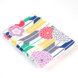
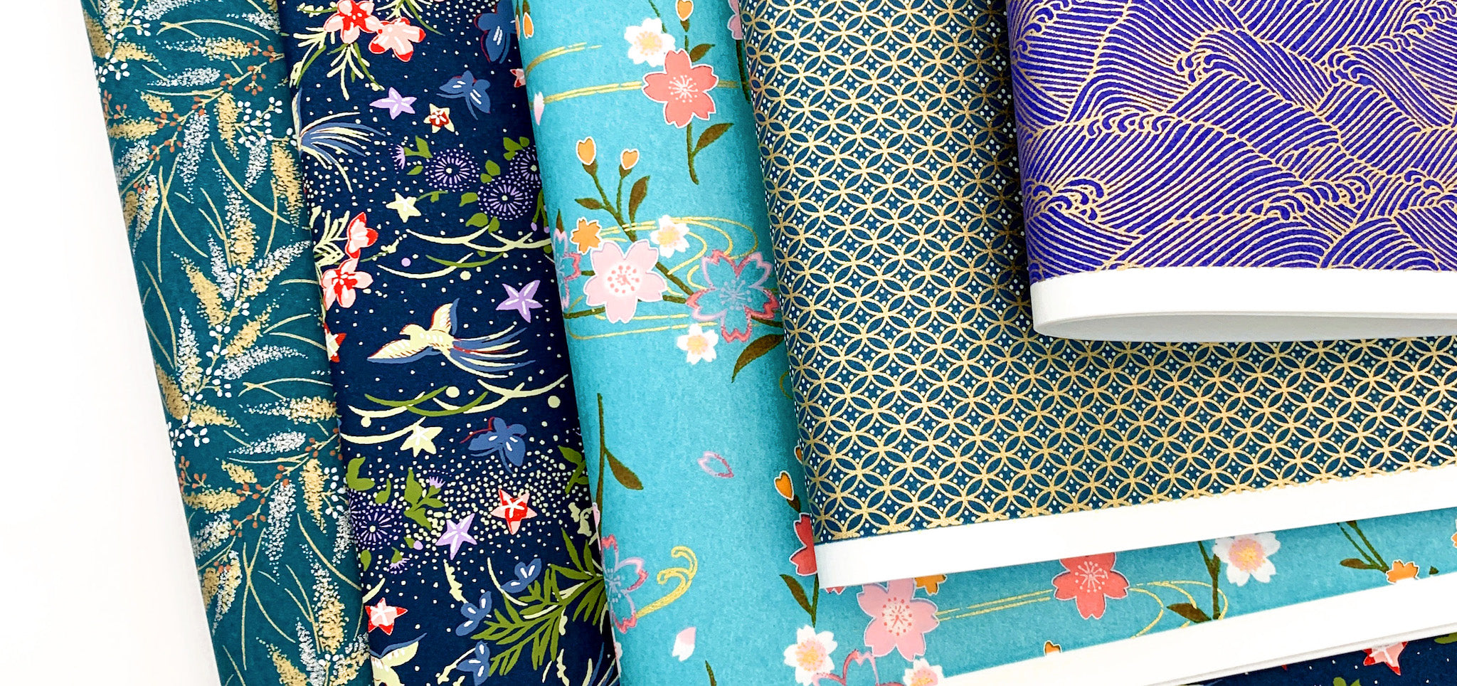
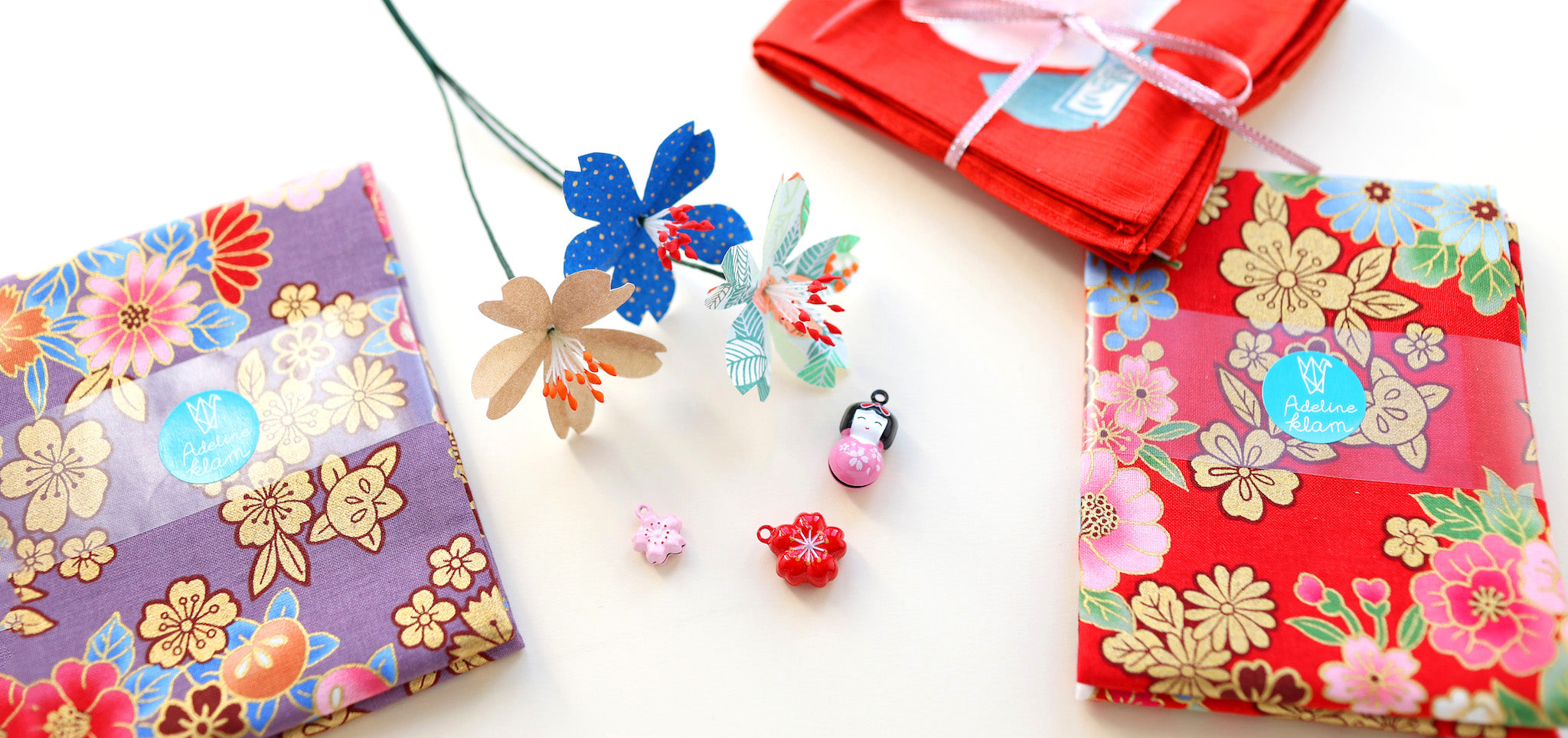
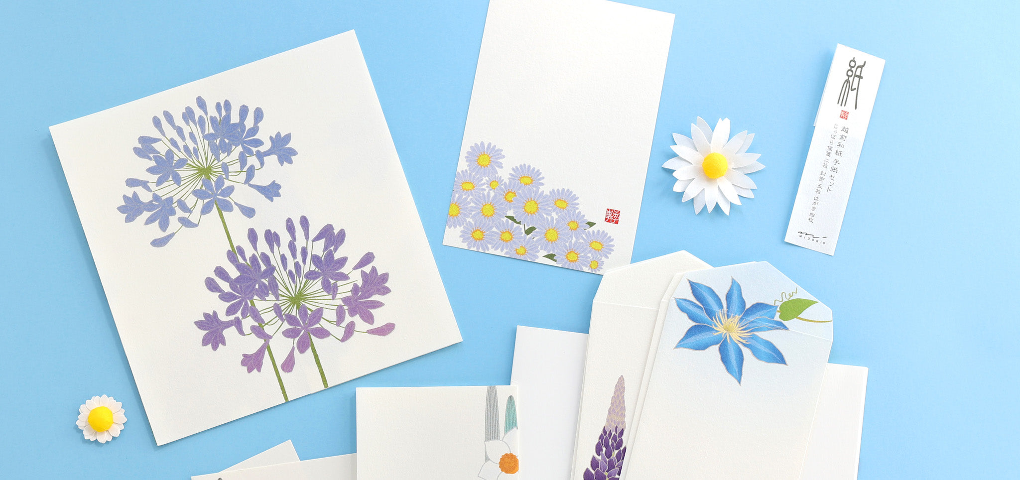
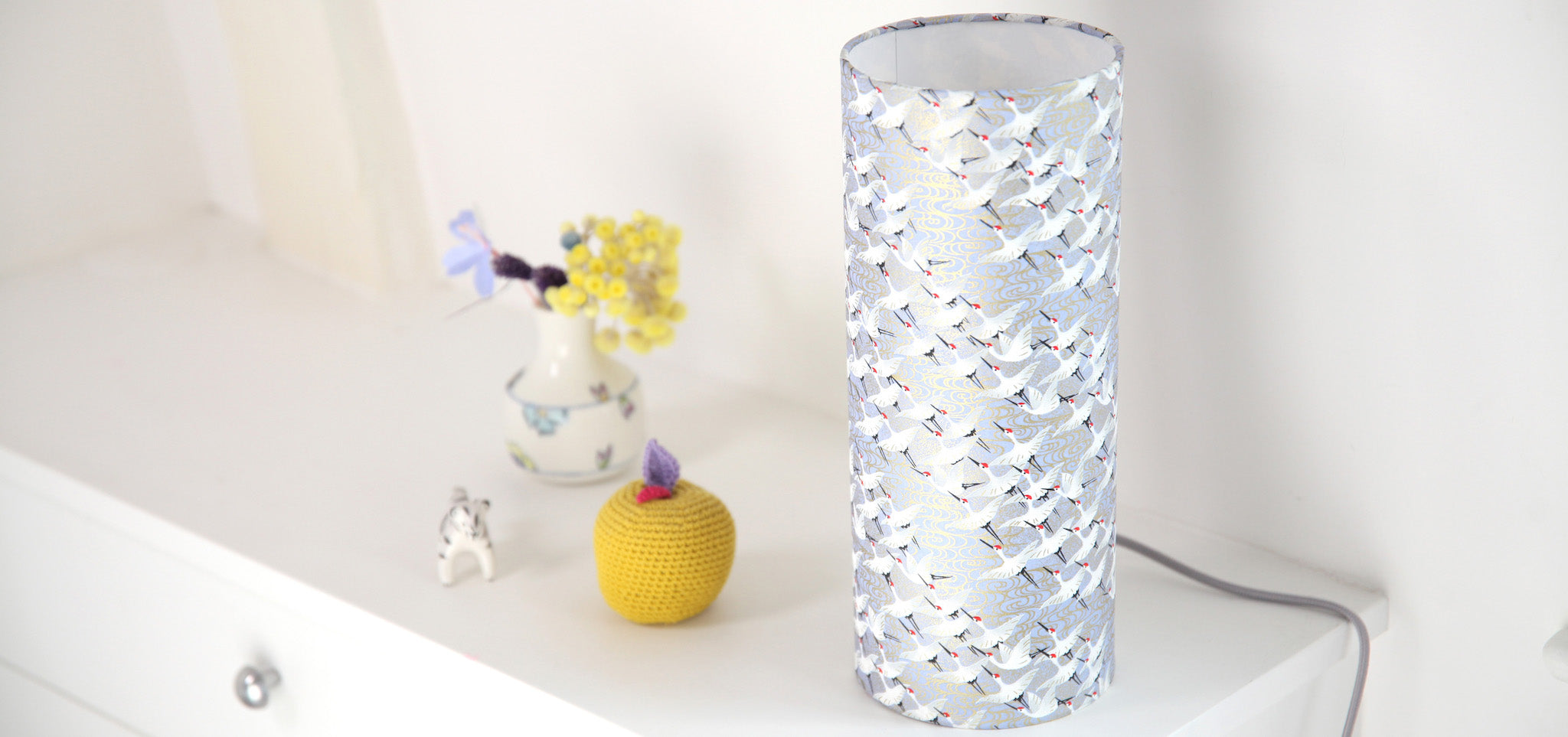
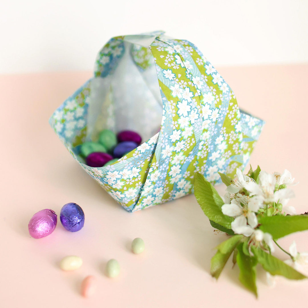
THE TURQUOISE BLUE AND PURPLE RANGE

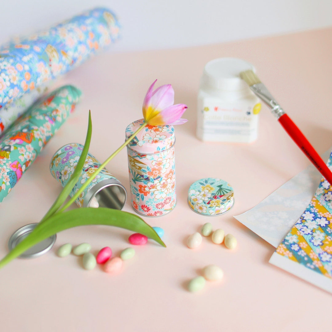
This time again, I offer you a colorful harmony with a warm/cold contrast between this water green, turquoise blue and this pink, purple of our “Crocus” origami pouch . I particularly appreciate the refreshing side of this range, softened by these few touches of purple.


|

|
|

|

|
 |
I hope you enjoyed this article and brought you joy and color! I will see you very soon on the blog for new articles inspired by Japan.
Warmly,
Adeline
What is your favorite color harmony among the four proposed in this article?








FRÉDÉRIKA SEQUARD > Merci à vous pour votre commentaire Frédérika :) C’est noté pour le jaune ! Nous sommes ravis que ce type d’article vous plaise.
Bonsoir Adeline ,..j’aime beaucoup L’orange et le bleu..
Autrement comme gamme colorée je serai intéressée par le jaune..
Merci à vous de partager vos inspirations..
Univers très poétique.
Bonne soirée,
Frédérika
Leave a comment