Inspirations - My Colorful Universes #1
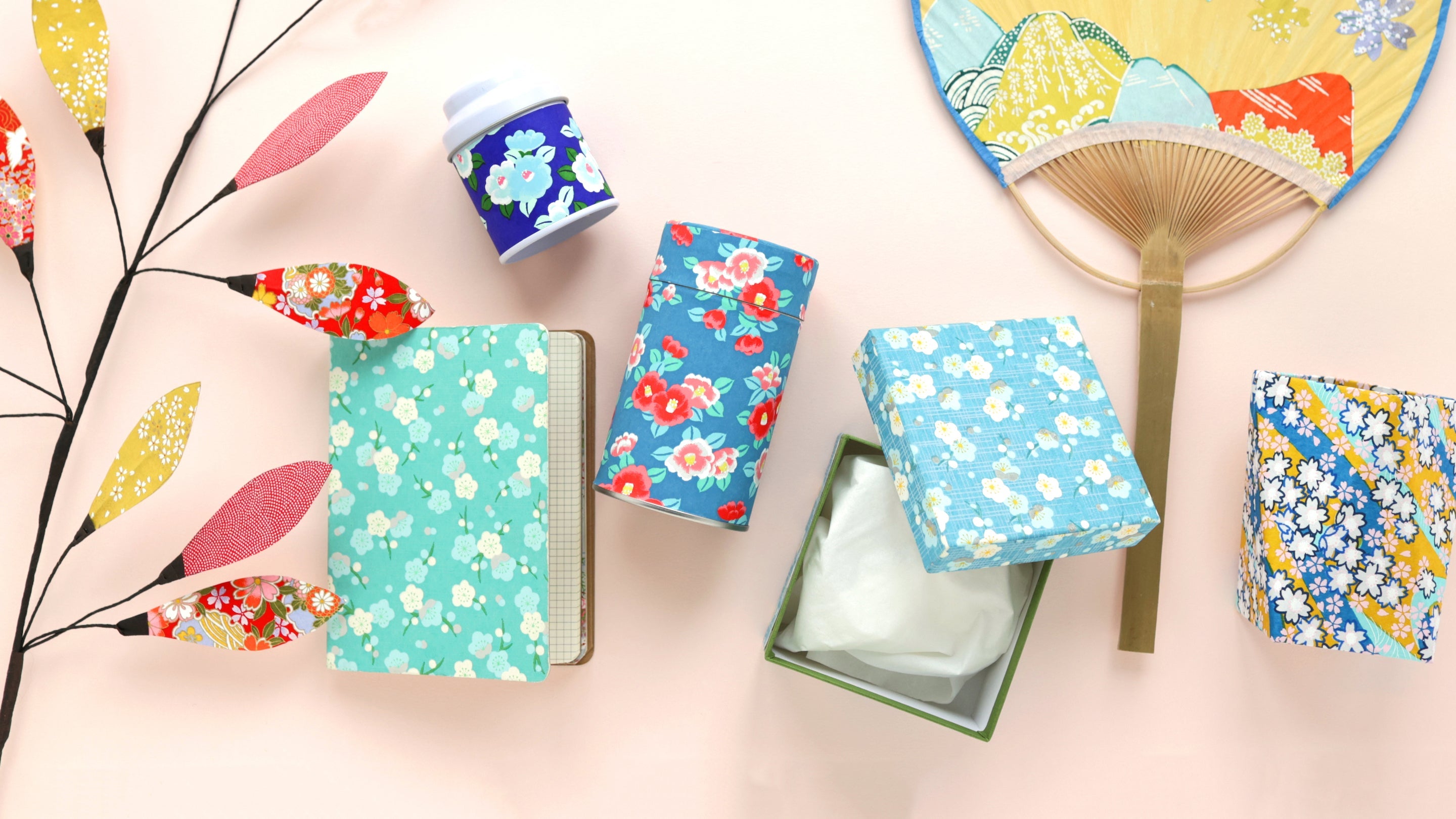
For this new article, I really wanted to present to you colorful harmonies from objects that I selected at the store. I find it a very enjoyable game to tell stories using objects that touch us!
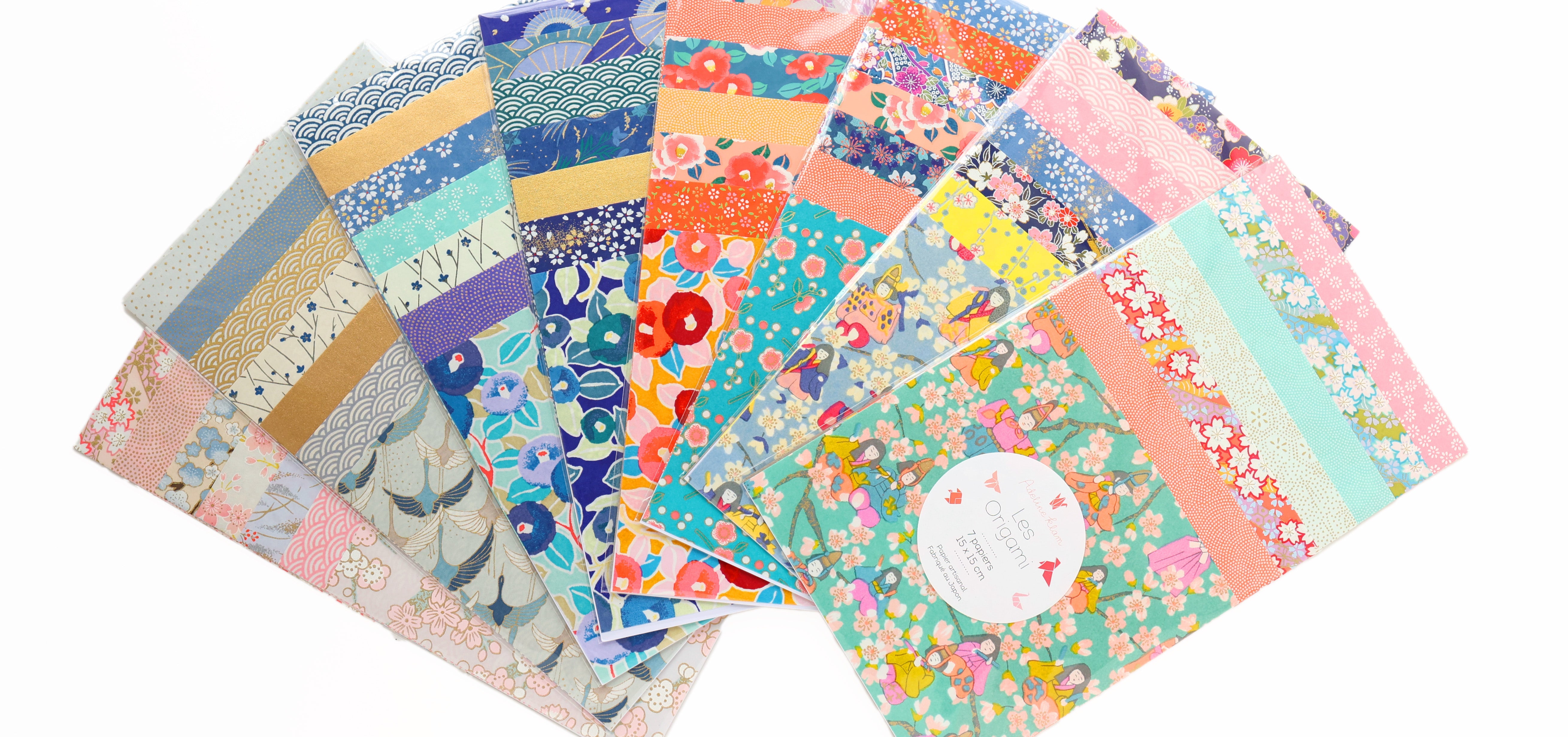
Today I offer you 5 colorful journeys! Each time I started with a “favorite” creation that I naturally embellished with other objects placed around it. I must admit that very often, Sandrine Thommen's art prints were the centerpieces! When it wasn't an illustration by Sandrine, it was an assortment of 15cm x 15cm Japanese papers that I make all year round at the shop (and yes, more combinations of patterns and colors)!
-------------------
For each colored harmony, I have listed the items presented in photos. If one of these products is not listed below, it is because it is not available on the e-shop but is in store. As for Sandrine's illustrations, we have a few copies available in store but you can also find them on her Etsy store !
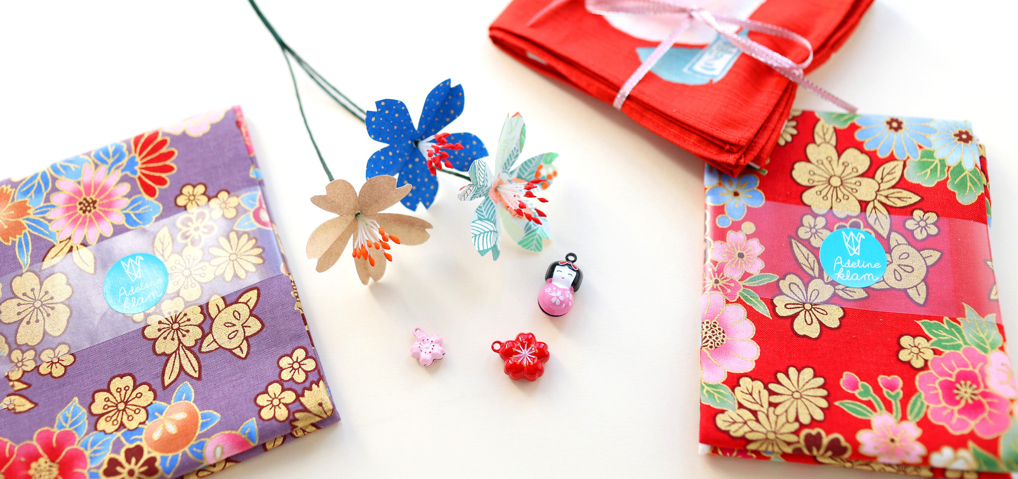
THE RED AND PURPLE RANGE

The love of kimono , kokeshi and these large floral patterns instantly reminds me of Japan. It’s this imagination that I often had in my head before I could set foot there!

 |

|

|

|

|
 |

|

|
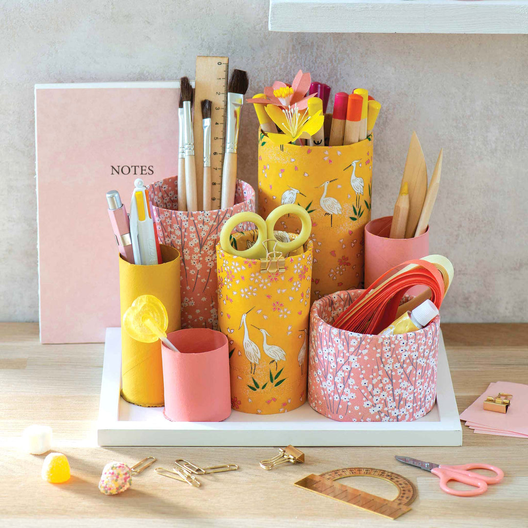
THE MUSTARD YELLOW AND ORANGE RANGE

I find that the warm tones of this assortment of Japanese papers combine wonderfully with Sandrine's work. The illustration of this little masked child is so cheerful! These autumnal colors give me the pleasant feeling of being on a walk in the forest and walking on a carpet of gingko leaves.

 |

|

|

|
 |

|

|

|
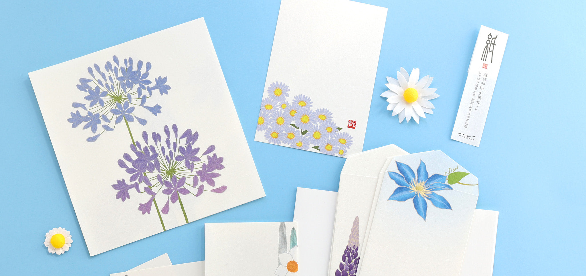
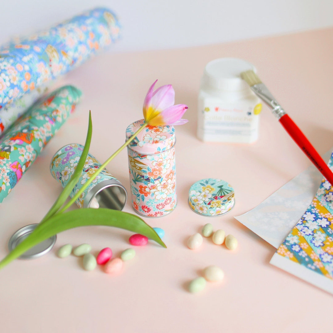
THE ACIDULATE YELLOW AND WATER GREEN RANGE

I always liked mixing tangy yellow and sea green. For me, it is a timeless, refreshing harmony, whatever the season! In this case, plants and florals are in order with the foliage motif pouch and the large sakura card.


|

|

|
 |

|

|

|
THE NIGHT BLUE AND ORANGE RED RANGE

With its shades of blue and touches of orange-red, I particularly like this more “masculine” universe, especially with this little character and his kimono with graphic patterns.


|

|

|

|
 |

|

|

|
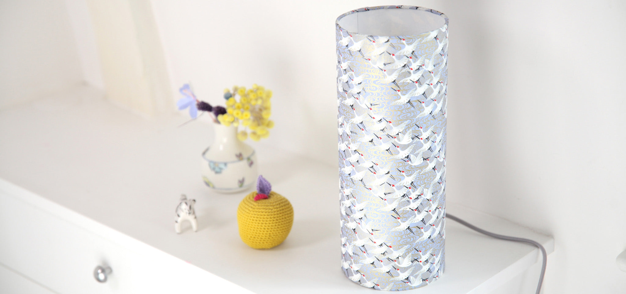
TITLE - WHITE AND GOLD RANGE 
This assortment of soft and elegant papers, in different tones of gold, reminds me of a winter garden under the snow. 
 |

|

|

|

|
I hope that these harmonies will make you want to imagine your own compositions based on your world and more broadly, that this article will have brought you joy and color!
I will see you very soon on the blog with new creative articles inspired by Japan.
Warmly,
Adeline
What is your favorite color harmony among the five proposed in this article?



MARIE FRANCE GRÉGOIRE > Merci à vous pour votre adorable petit mot ! Cela nous touche beaucoup :) Effectivement, la gamme rouge et violette est idéale pour apporter un peu de chaleur en cette fin d’année. La gamme vert d’eau et jaune acidulé est quant à elle plus estivale (mais tout aussi intéressante) !
MAUGER PIERRETTE > Merci beaucoup pour votre commentaire :) N’hésitez pas à nous partager vos réalisations par e-mail, par Instagram (ou encore Facebook) !
THIMON > Merci beaucoup pour votre retour ! La gamme rouge et violette est l’une de celle que je préfère :) Elle fait du bien au moral !
Bonjour
La gamme rouge violet est magnifique, je la trouve chaleureuse, gaie, vibrante.
Le choix des tissus, papiers et autres est harmonieux et incite à la création.
Merci.
VT
Bonjour pour moi ma concordance préférée est le jaune acidulées et le vert d’eau. J’ai déjà fait plusieurs objets en cartonnage avec ces assortiments. Merci pour tout votre travail et ces propositions.
J’adore l’harmonie rouge et violet pour éclairer l’hiver à venir et les jours de fêtes à venir. Mais j’aime aussi beaucoup le vert d’eau et le jaune acidulé qui me font songer aux couleurs de l’océan et d’une plage déserte….
Merci pour cet article haut en couleurs…. Il a éclairé ma fin de journée !
Leave a comment