How to combine colors: yellow and water green
This project has been running through my head for a long time and today I would like to start a small series of articles around color associations. In my eyes, color is often the starting point in the creative process, because it allows you to imagine a mood, an atmosphere.
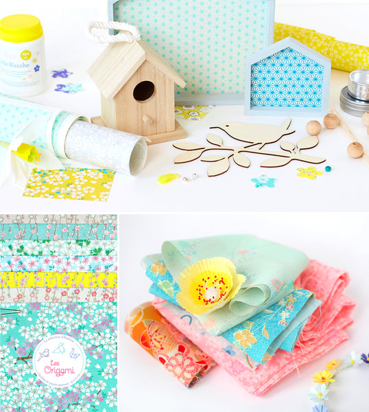
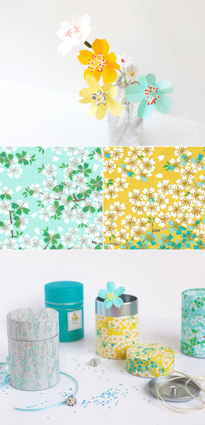
To start this series, I chose a very simple range which particularly inspires me at the start of spring, it is the combination of water green and yellow. At the store, many of you appreciate these two colors. And good news, they are very easy to combine! Sea green (or mint) goes very well with a pale yellow, or a bright yellow, or even a yellow tending to mustard.
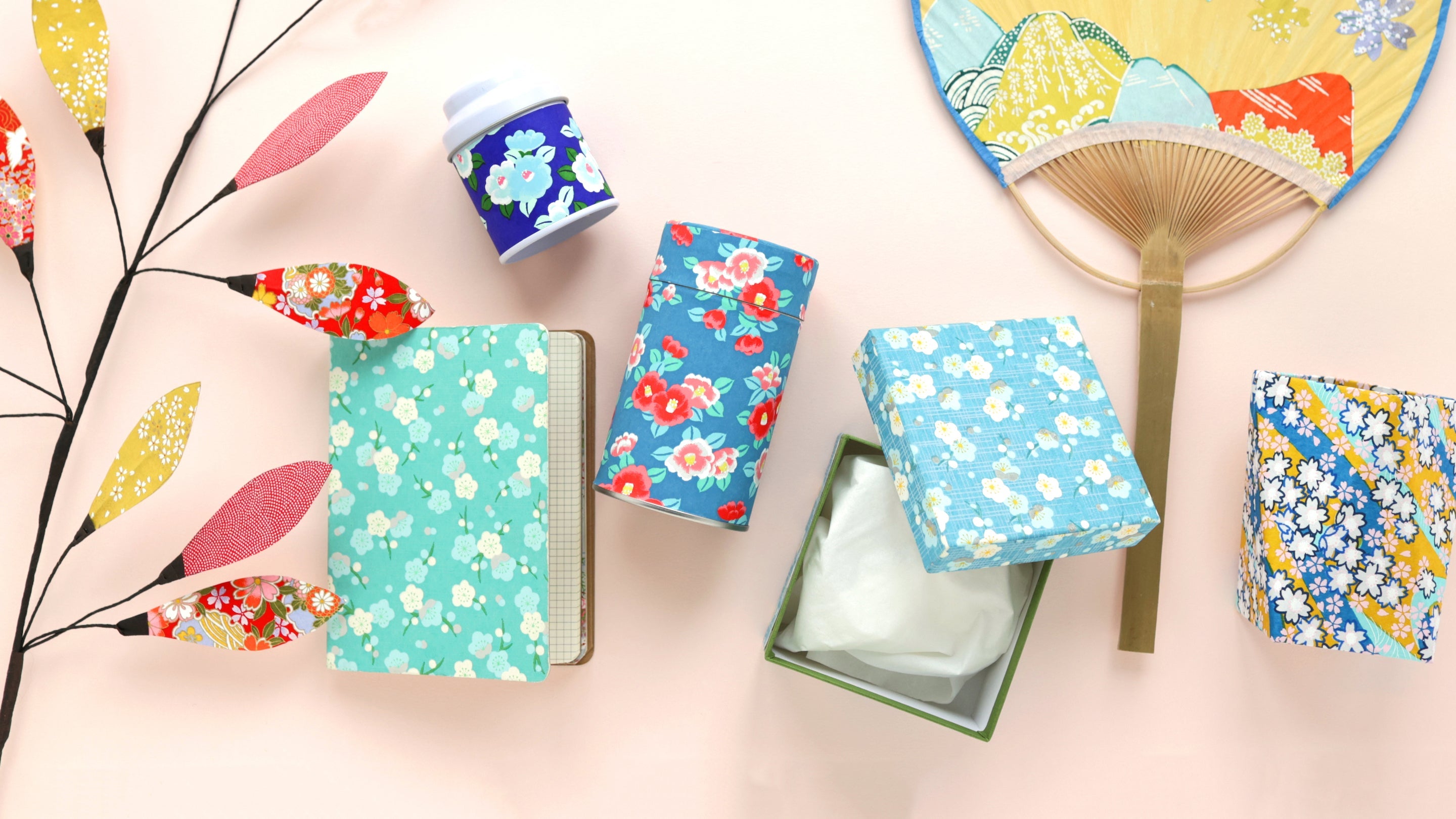
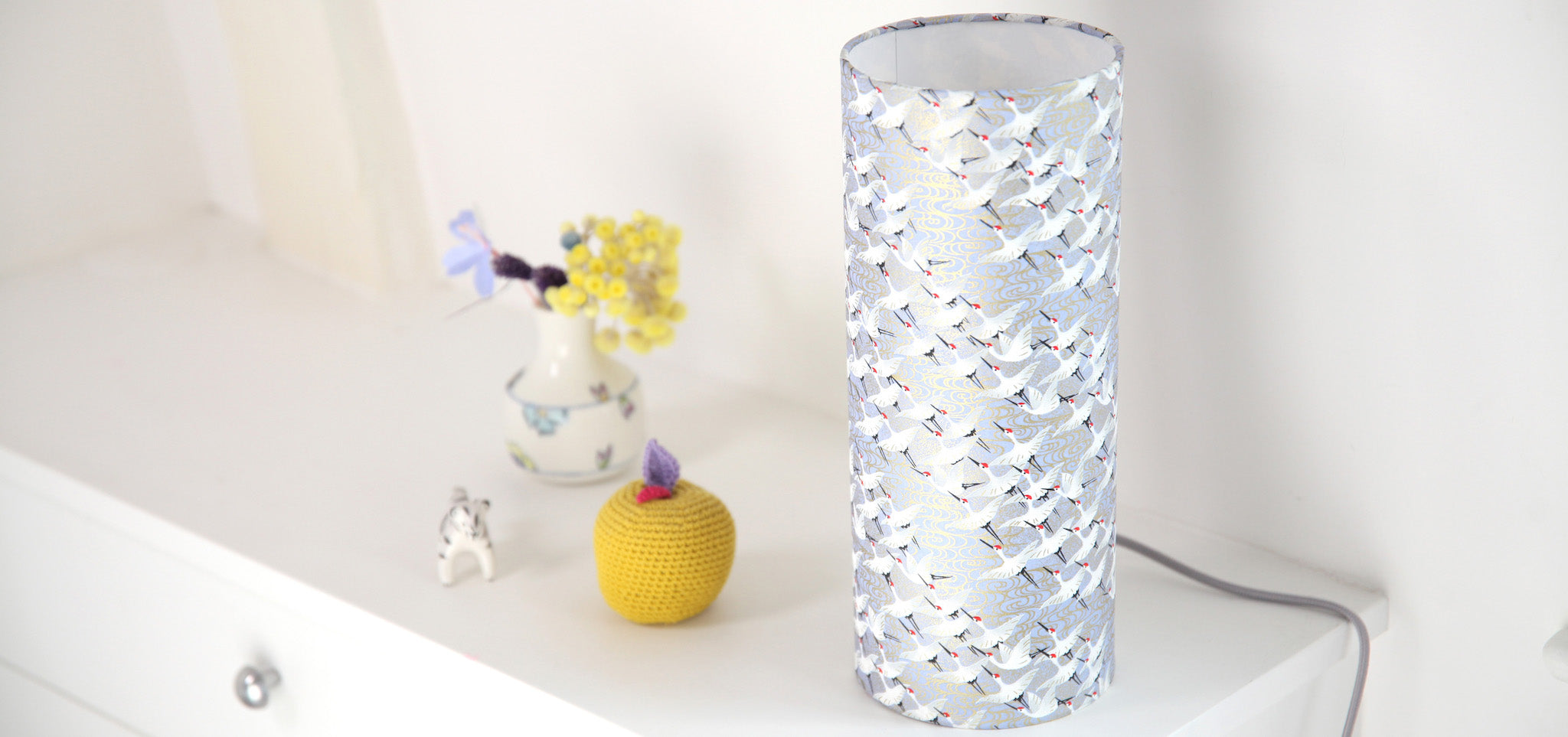
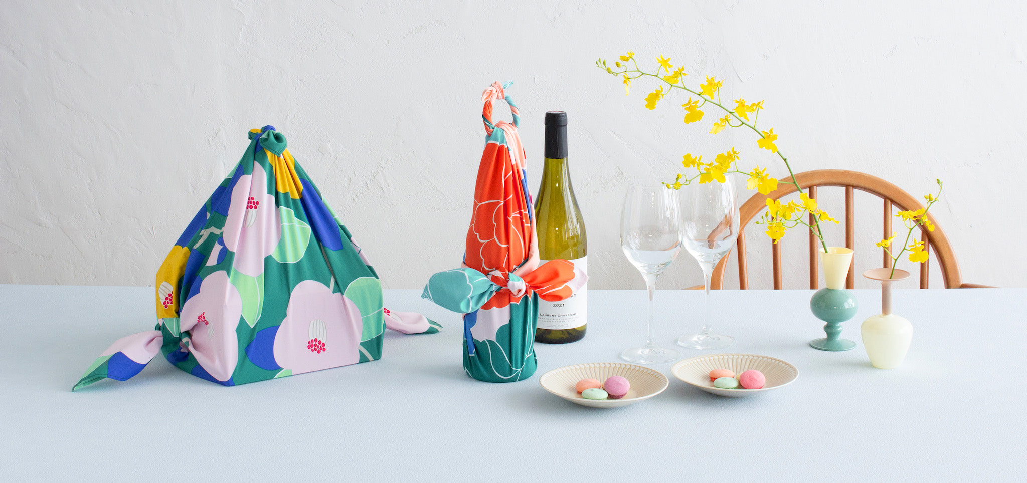
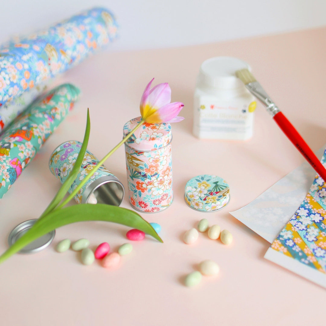
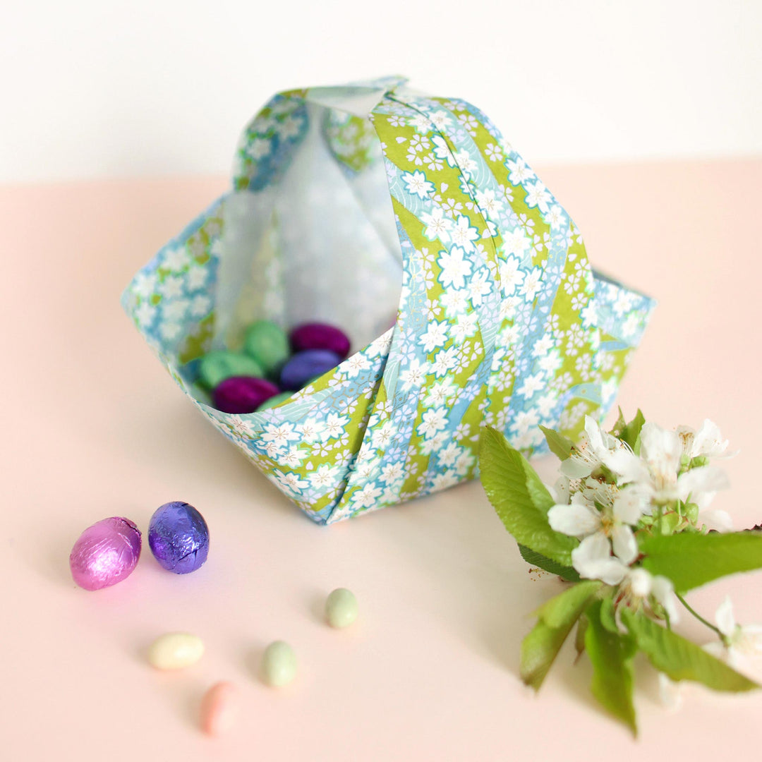
Refreshing without being cold, soft without being watered down, I find that this combination can be very subtle and pleasant both in interior decoration and for the creation of small objects or even patterns. To illustrate this article, I have therefore chosen visuals which highlight these varied uses.
How to use it ?
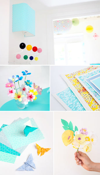
In terms of decoration, its lightness and freshness are particularly suitable for a child's bedroom, but it can very well be used in another room in the house. Personally, I really like rooms where the walls and floor are white. This allows you to add touches of color through furniture or decorative elements which then give a “tone”, an atmosphere to the space.
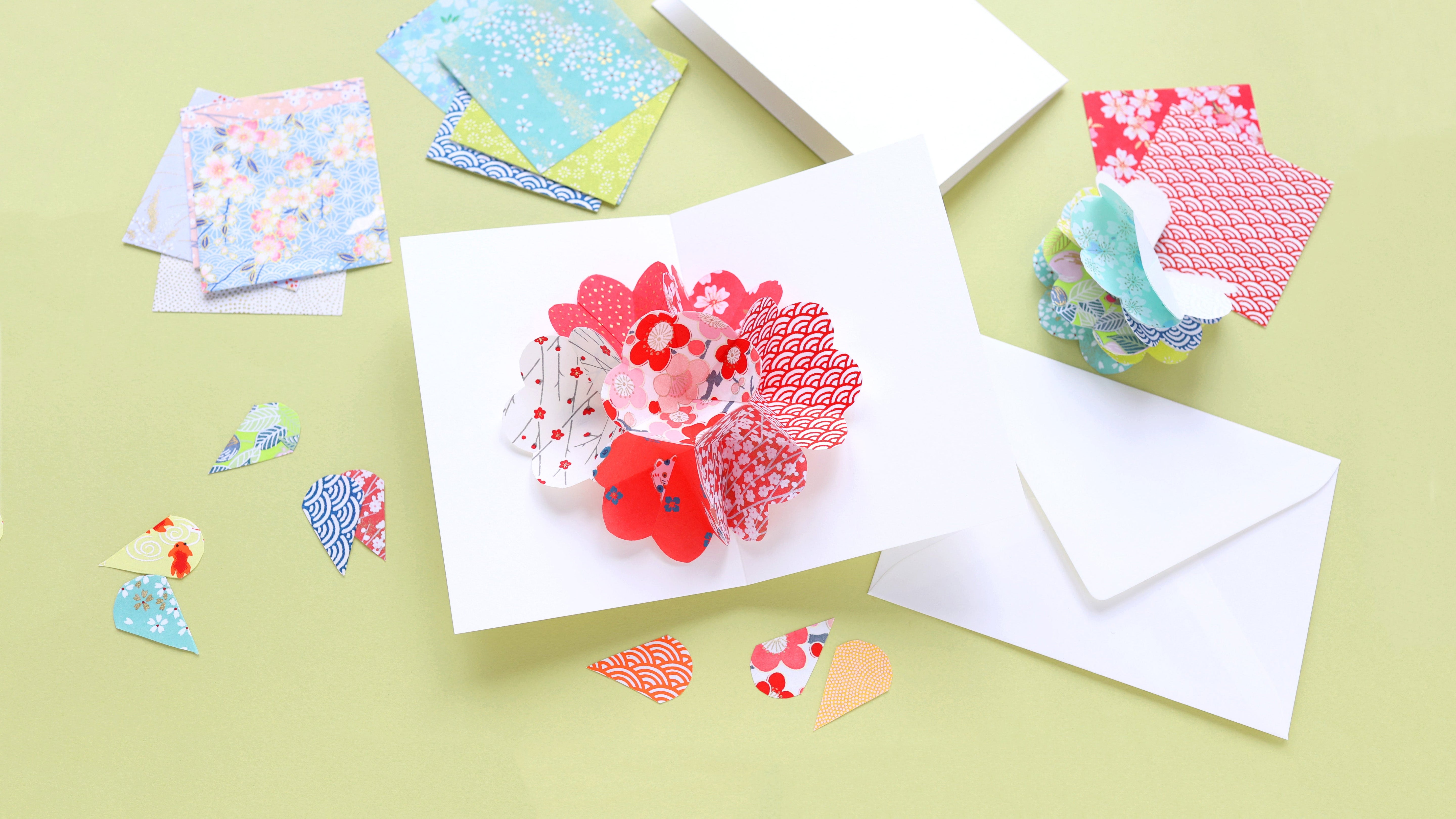
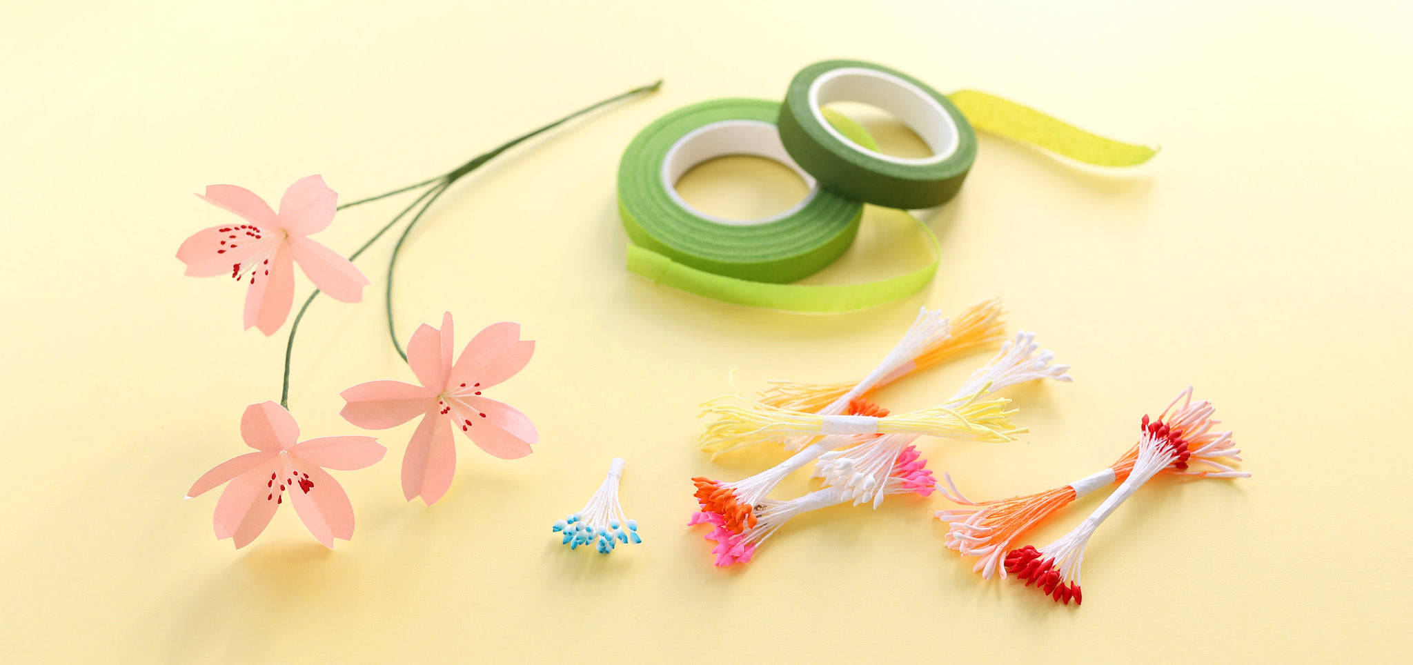
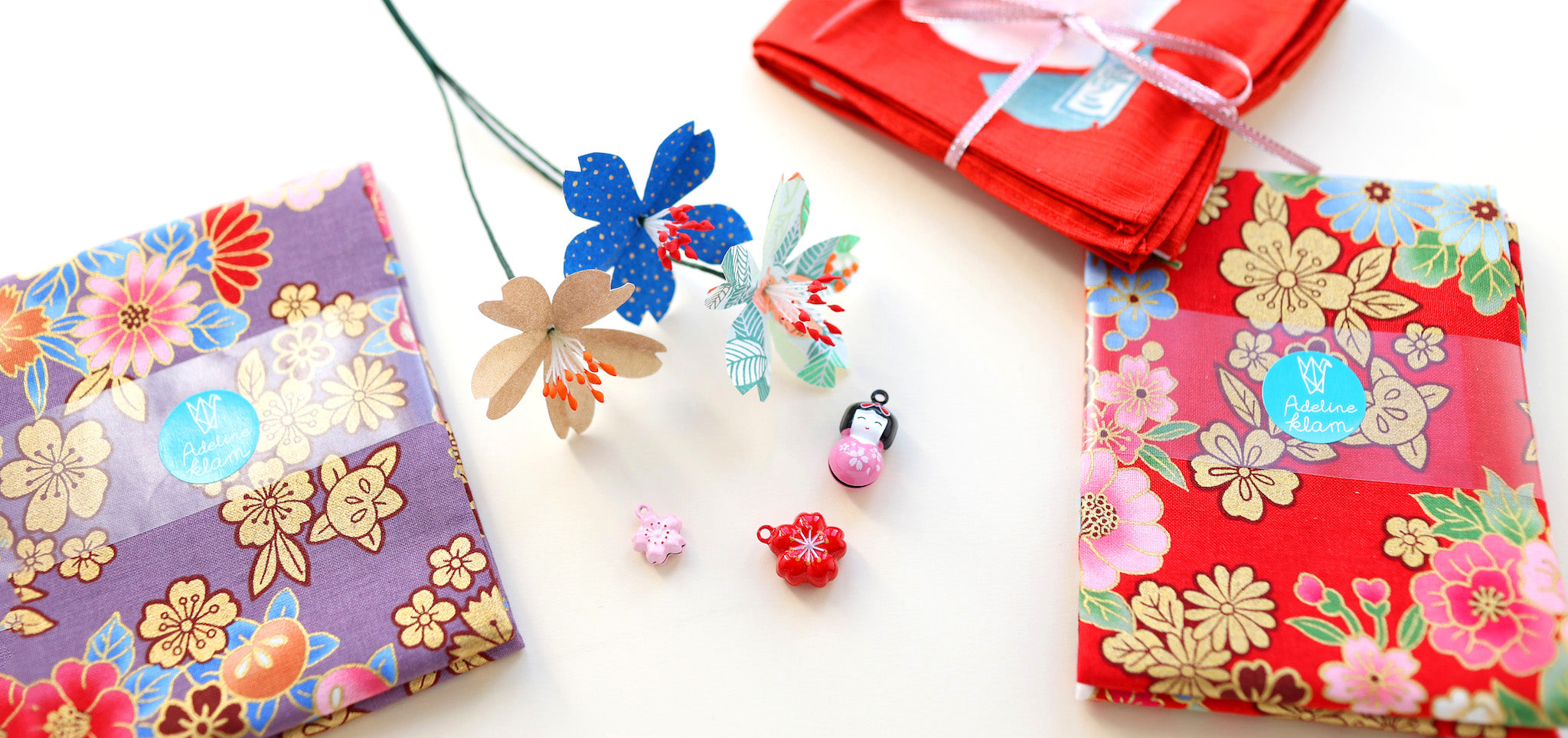
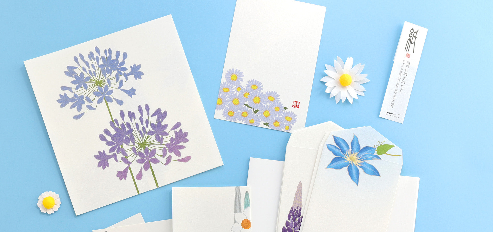
For small creations, yellow and water green are perfectly suited to creating bouquets of paper flowers, as long as you enrich it with other shades. You can make personalized cards with these colors evoking cheerfulness, for a birthday for example. Joyful and light, this combination also lends itself very well to making small party decorations out of paper: garlands, origami boxes, etc. 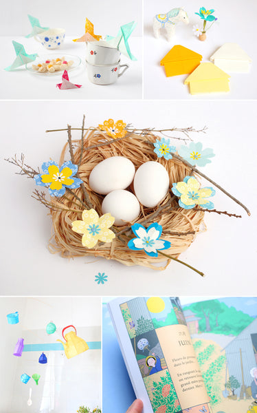
Mobile Petit Pan // Book “Choses Petites et Merveilleuses” by Nathalie Dargent, illustrations by Sandrine Thommen 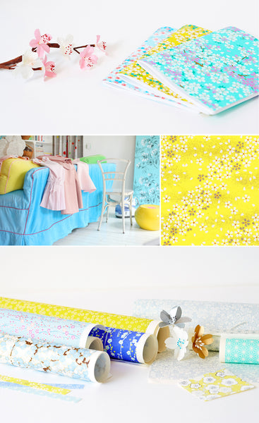
How to combine it?
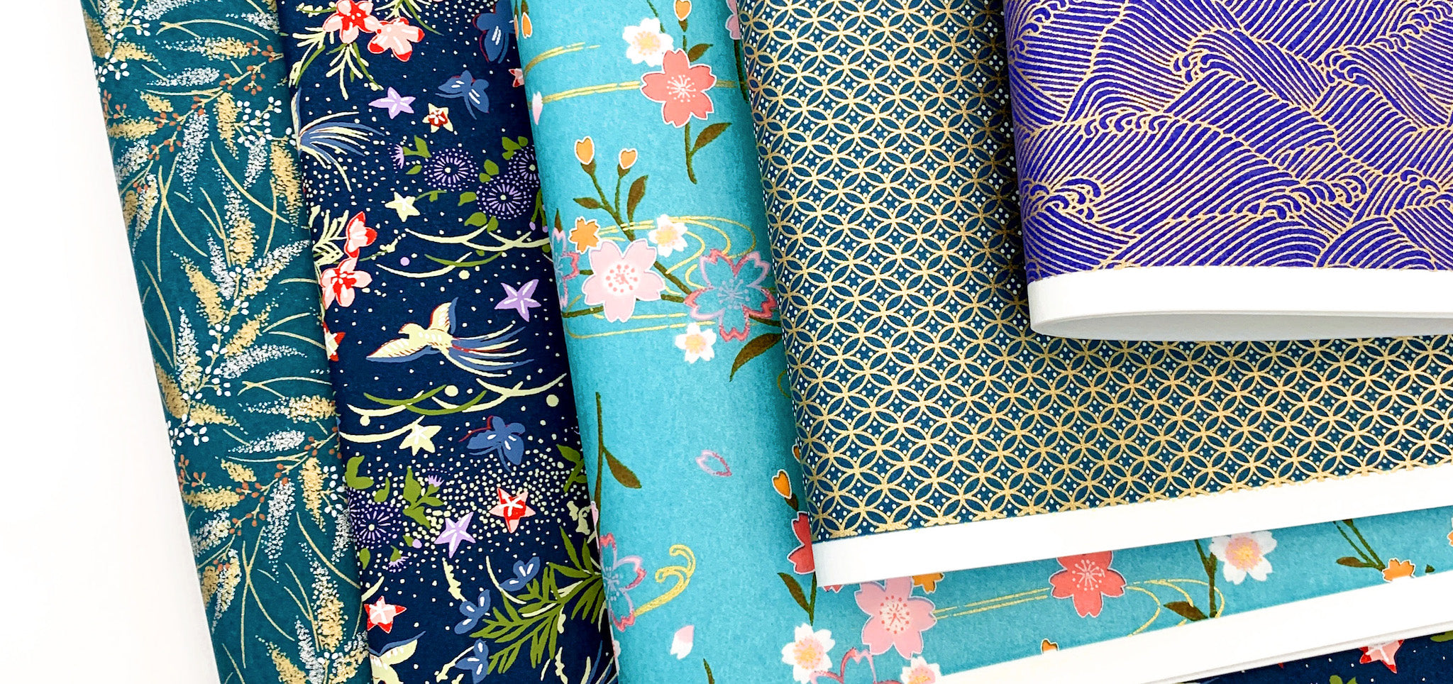
Together, sea green and yellow constitute the basis of a palette that can easily be enriched. It can simply be enhanced with slightly denser tones, notably turquoise. A darker, more intense blue will give it a more assertive and deep presence.
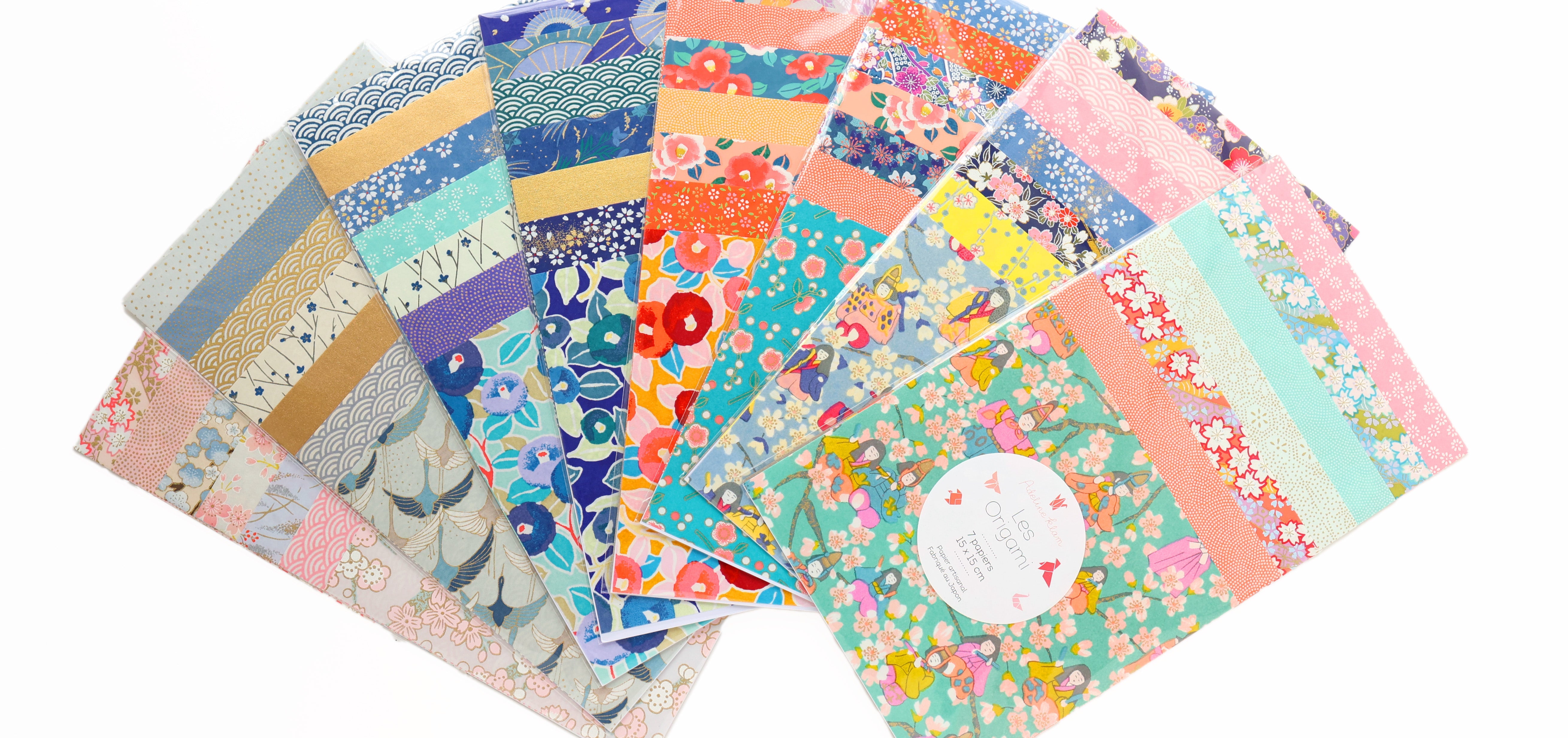
The yellow/water green palette also goes very well with certain tones of pink or coral, for cheerful, colorful and childish worlds.
But of course, there are still many possibilities for combining these colors! I hope these suggestions will inspire you.
See you soon,
Adeline



Leave a comment