How to combine colors: blue and orange
Today, I am once again continuing my series of articles on color combinations with two pretty shades that I like: orange and blue. A true source of inspiration, I often combine them in my creations. What they have in common is a symbolic asset: they have the capacity to unleash imagination and creativity!
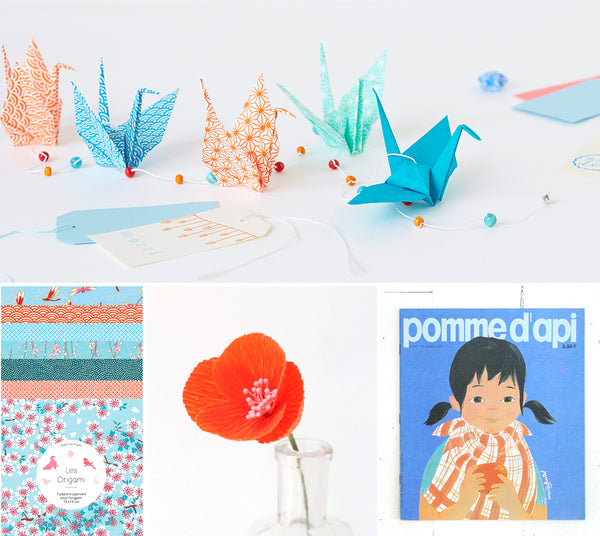
A little bluish freshness, combined with an orange warmth: this is a very contrasting combination. Opposite on the color wheel, these two colors are therefore perfectly complementary.
Both invigorating and serene, I find that this combination is useful for waking up a room or illuminating small objects. I have punctuated this article with harmonious visuals illustrating the various uses of this range, sometimes bright, sometimes deep.
How to use it ?
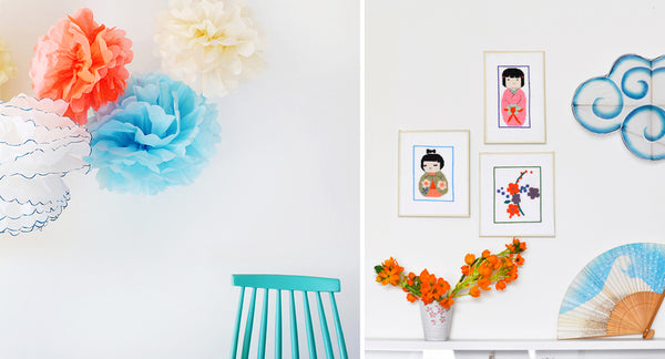
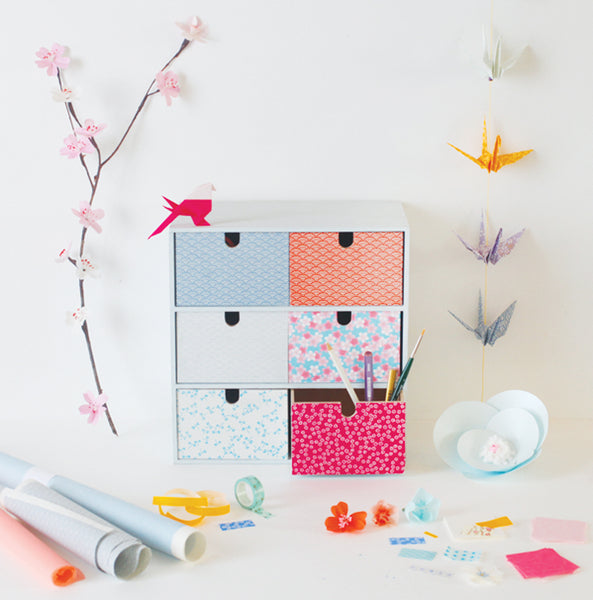
Blue is renowned for being “the color that doesn’t make waves” (Michel Pastoureau, The Little Book of Colors). As a decoration, it brings softness and lightness to any room in the house. Soothing, blue can also be used in a bedroom to create an atmosphere conducive to calm and rest. I also opted for a combination of turquoise, coral and sky blue to decorate ours. Good to know: when it is light, blue makes rooms appear larger. By adding touches of orange, the atmosphere is revived and brightened!
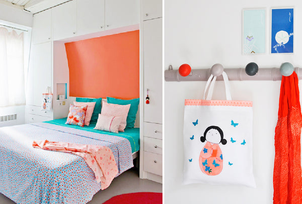
Photo credit on the left: Germain Suignard for Maison Créative
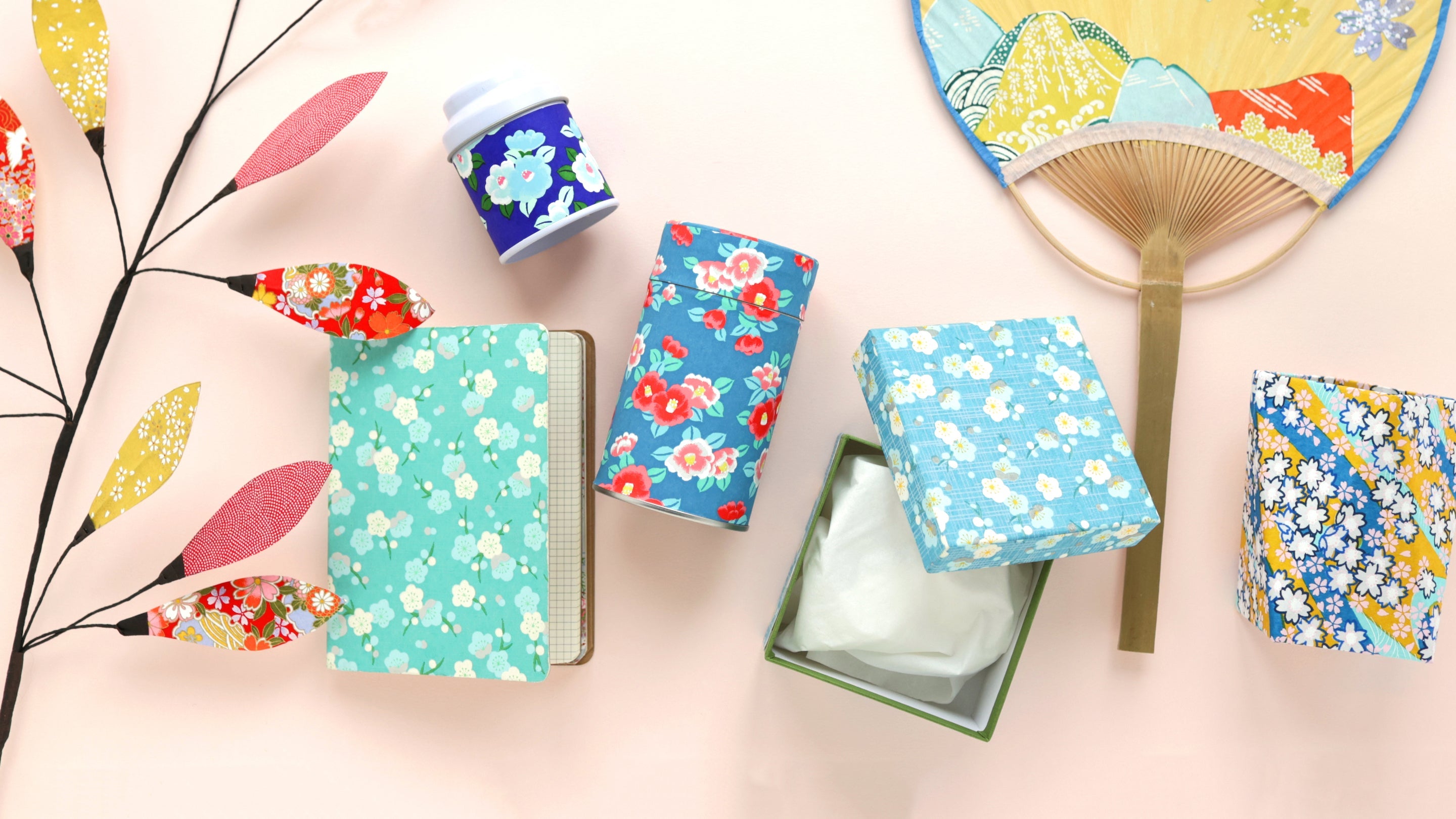
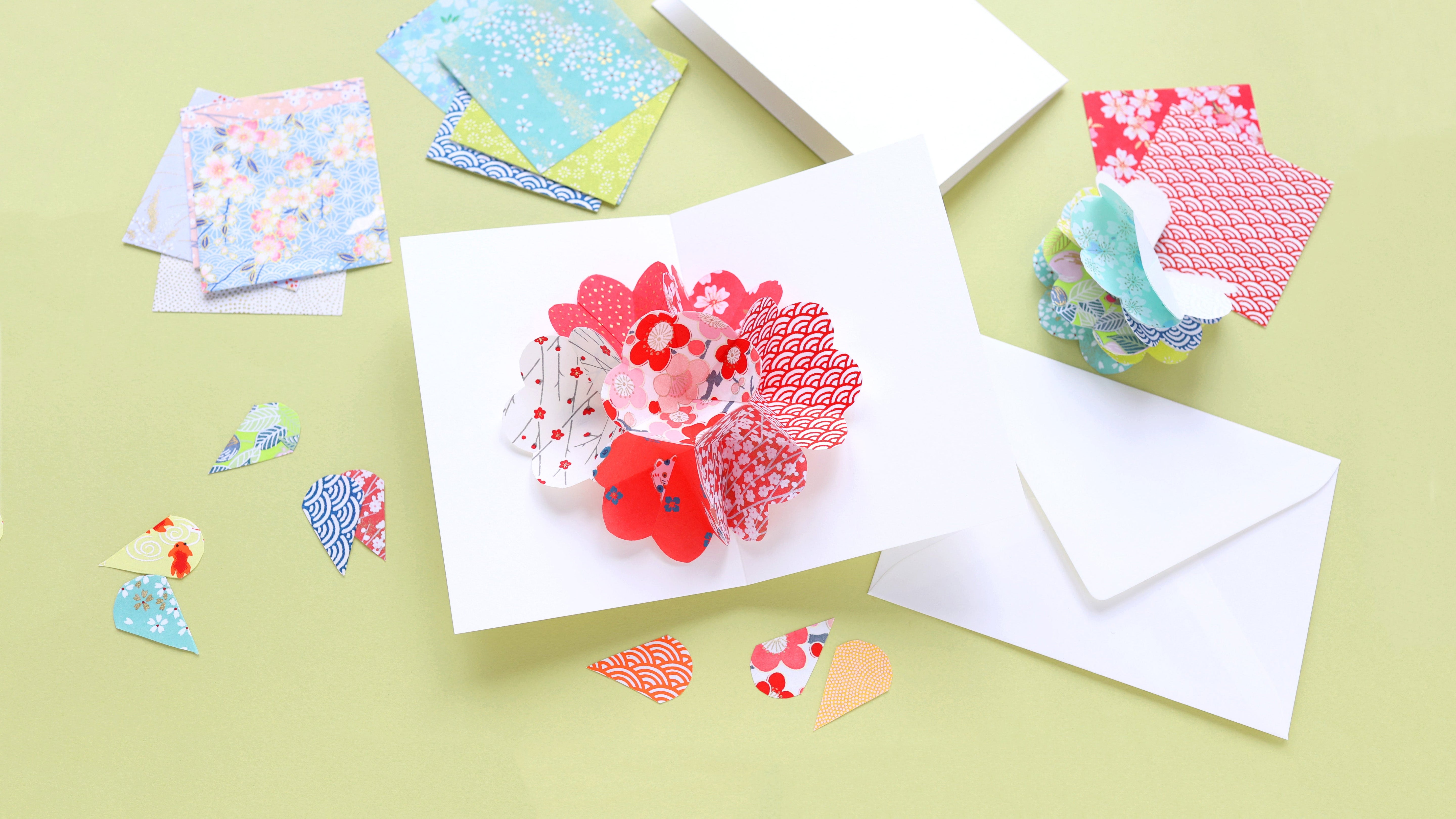
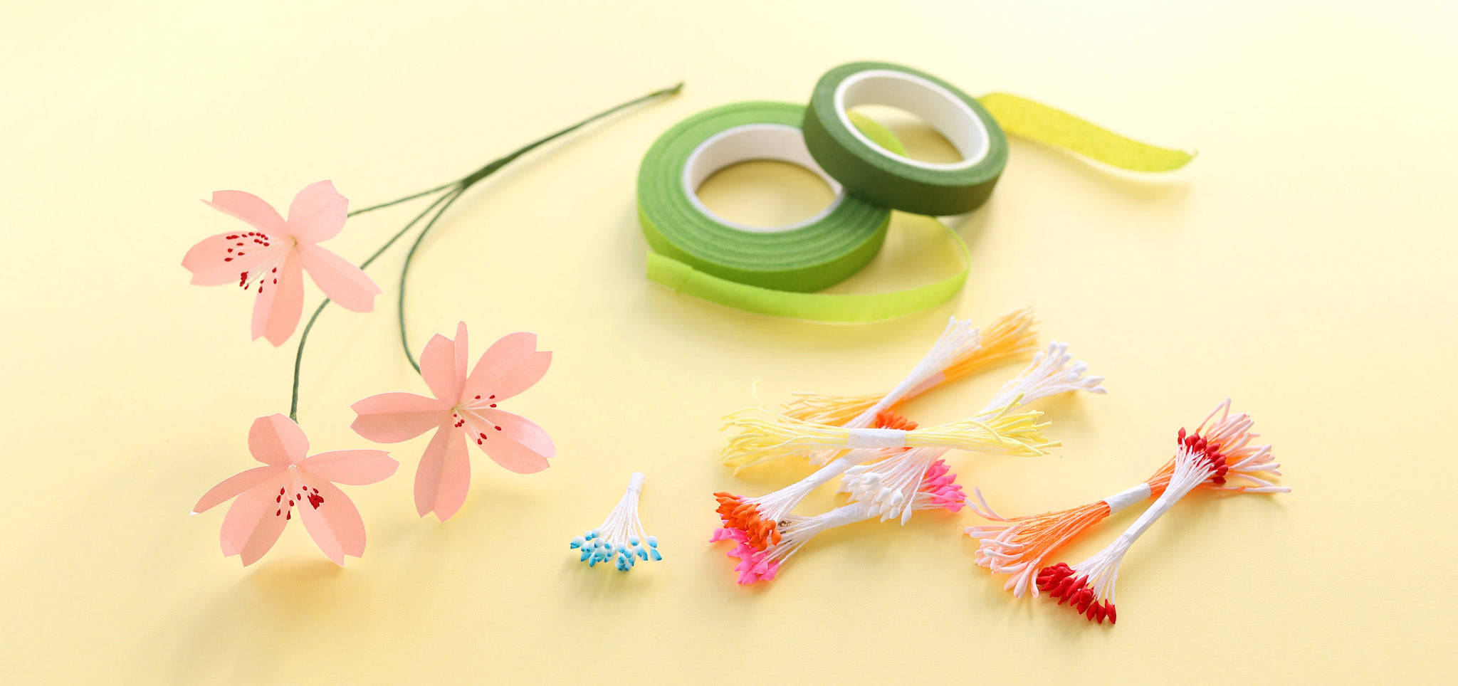
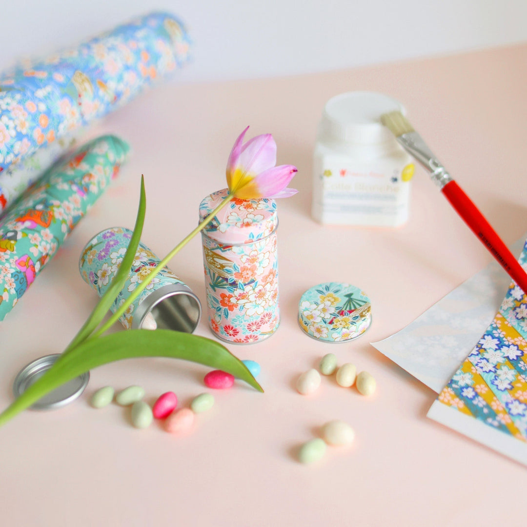
In terms of creation, many of you in stores choose paper bearing these colors for tea boxes. An origami garland made with this range allows you to add a bit of energy to a white wall above a desk for example. Evoking nature, this combination of colors can echo summer, the shine of the sun at the end of the day and the sea, the ocean. These two colors are also perfect for making flower bouquets. Bringing joy and optimism, they can also be used to make birth announcements.
How to combine it?
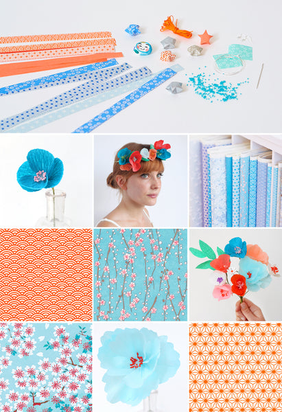
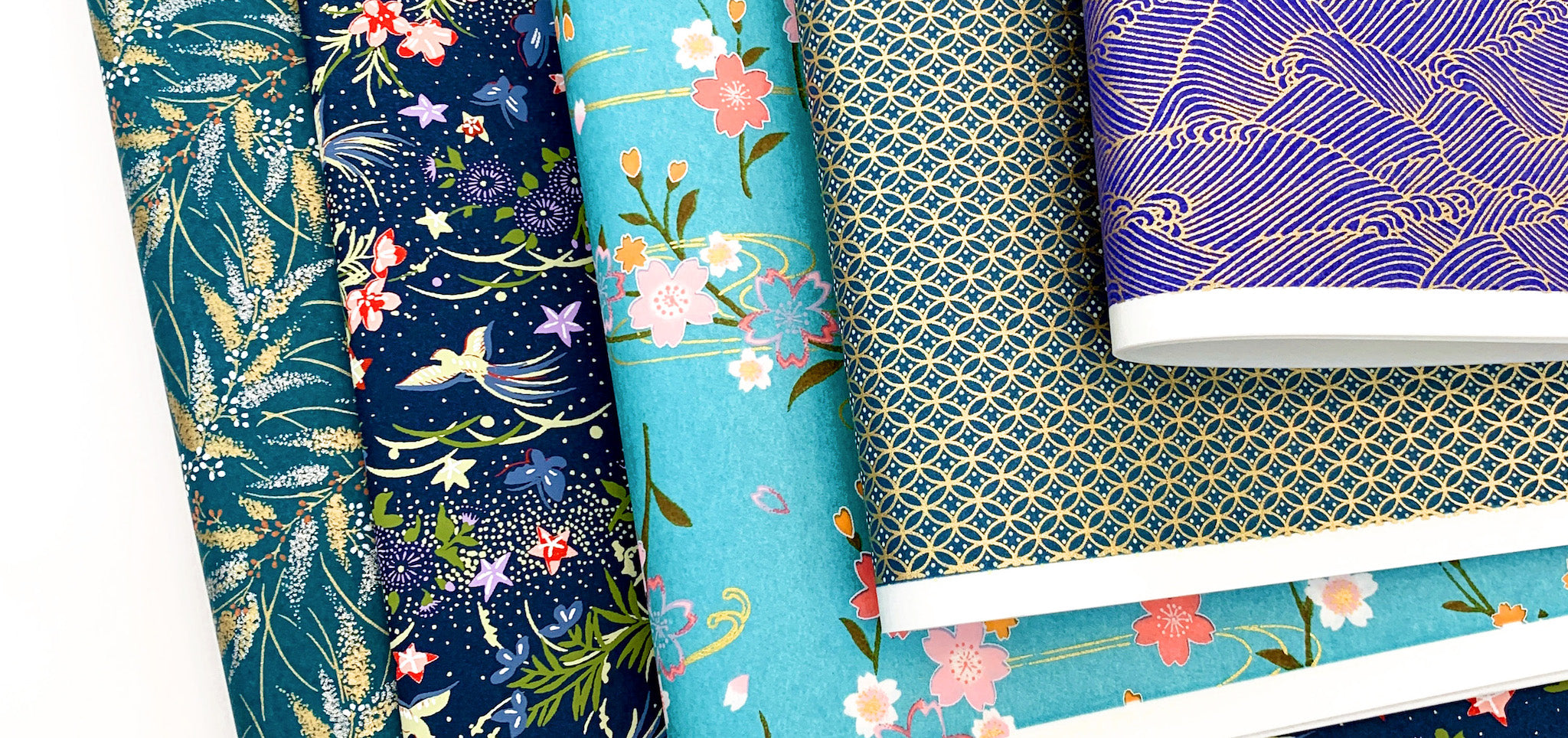
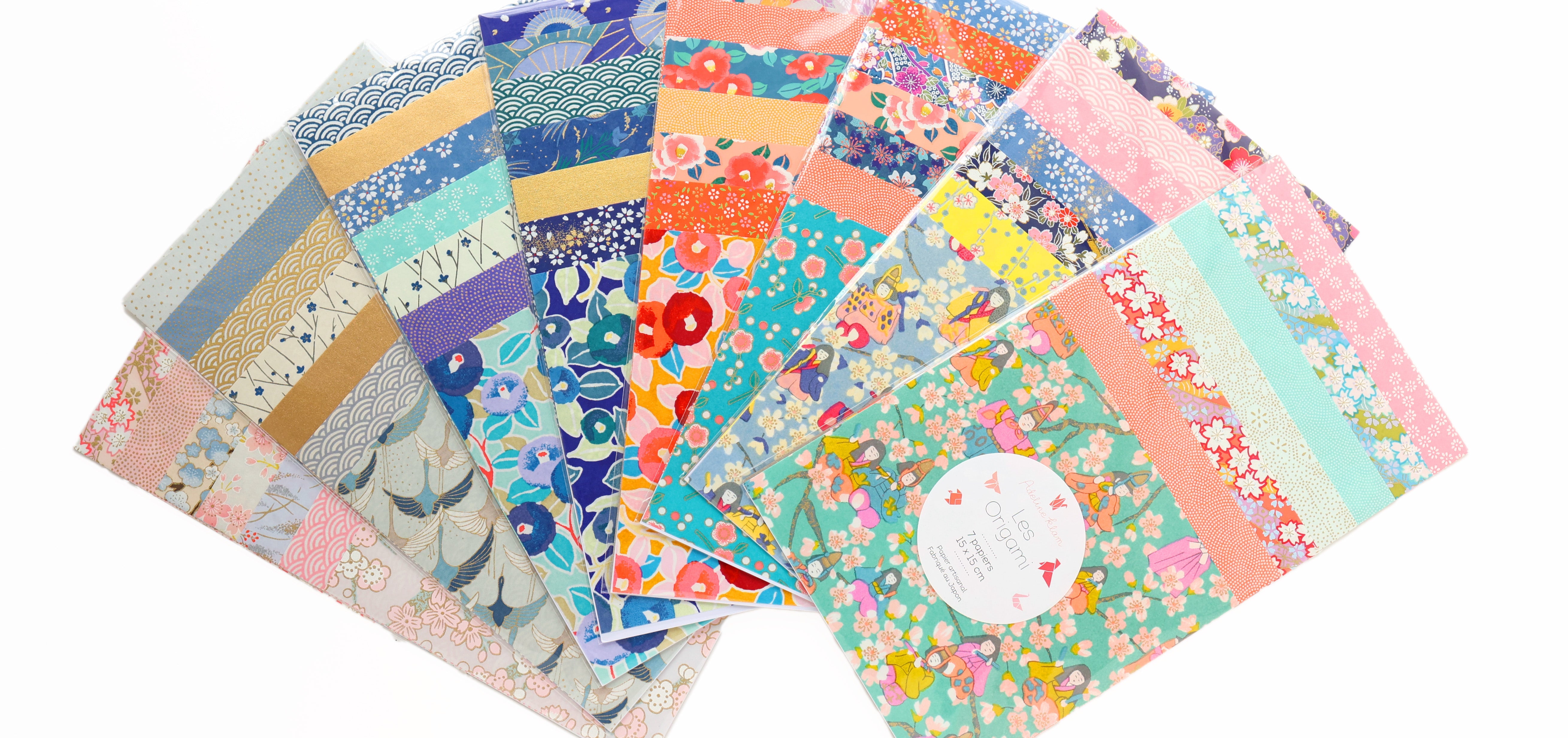
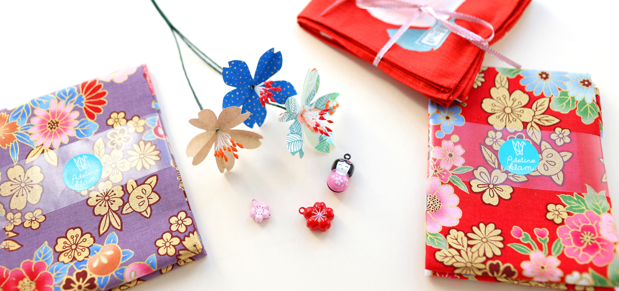
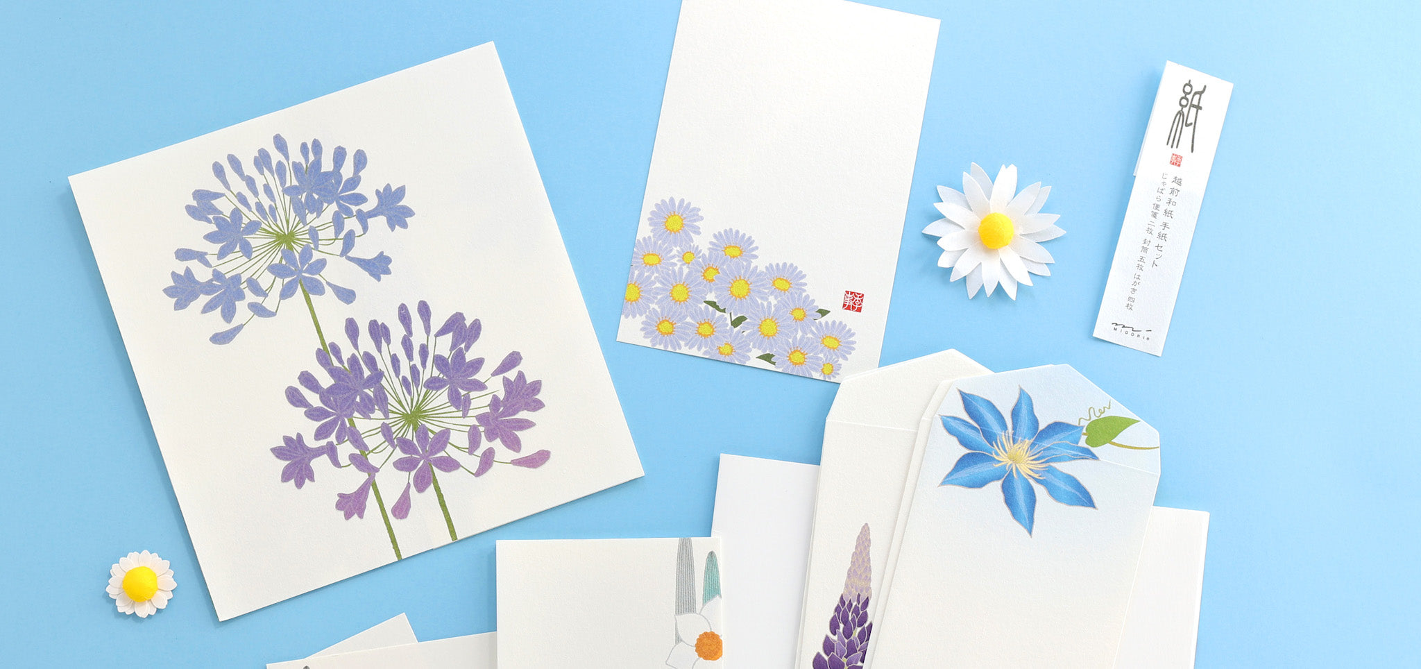
The advantage of blue is that it can be available in infinite tones, each evoking very contrasting emotions. We can therefore easily have fun varying this color and punctuating it with a more or less nuanced orange. In my creations, I favor very contrasting oranges, tending towards red or coral. To create a cheerful and childish atmosphere, I add tones of yellow. Conversely, completing this color combination with warm shades like red or pink allows you to create an atmosphere full of femininity and depth. Finally, to add a graphic touch to the whole, I sometimes use neutral shades like white and black.



EMMA > Merci pour votre petit mot Emma (et pour avoir pris le temps de nous écrire) ! C’est effectivement une belle combinaison colorée, apaisante et stimulante à la fois :)
Personnellement, j’ai testé cette combinaison dans mon bureau et c’est incroyable comment cela peut transformer un espace. Ce n’est pas tous les jours que vous trouvez une association qui peut à la fois calmer et stimuler l’esprit, n’est-ce pas ? Et pour ceux qui craignent de se lancer, un petit conseil amical : commencez par de petits objets ou des accents décoratifs. Qui sait ? Vous pourriez finir par adorer cette rencontre audacieuse entre ciel et soleil !
Leave a comment